


Table of contents:
JetMetrics App update
Article
Post of the week
Dashboard of the week
JetMetrics App weekly update
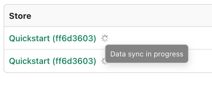
⏳ Loading status indicator
When a store is first connected, it can take a bit of time to load the full data history.
Until now, there was no way to tell if the process was still running — or already done.
We’re fixing that with a clear loading indicator, so you’ll know exactly when JetMetrics is ready to use.
No more guessing. Just wait → load complete → dive in.
Check out the product’s roadmap – https://jetmetrics.io/roadmap
JetMetrics is currently in a closed beta. Book a 1:1 demo to connect Shopify store.
10 E-commerce Metrics That Are Easy to Misinterpret
They look simple. But they mislead.
It’s not the one that drops. It’s the one that goes up — and hides a problem.
Some metrics look helpful. They’re familiar. They go into every report. But they’re easy to misread — and that’s what makes them dangerous.
In this article: 8 popular metrics that often deceive — and how to interpret them correctly.
These aren’t bad metrics. In fact, they’re some of the most common and trusted ones. But precisely because they’re so familiar, they often slip by without critical thinking.
Let’s break down where each one might go wrong — and how to read it properly.
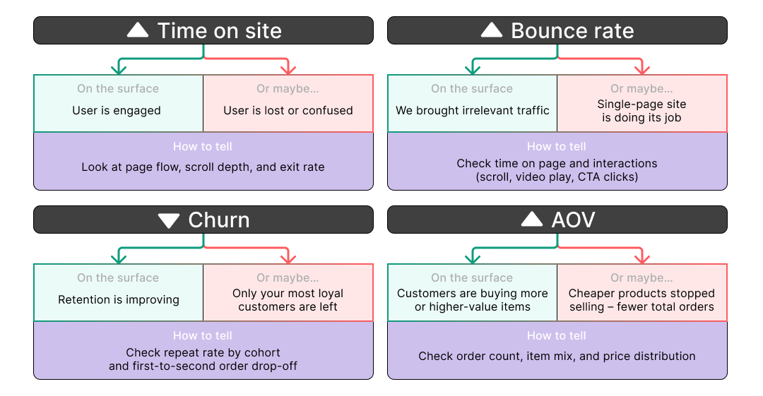
#1 Time on Site
Time on Site measures the average duration of a session on your website.
Total time spent across all sessions ÷ Total number of sessions
What it seems to say:
Users are engaged and spending time exploring your site.
Why it might be misleading:
They might be lost, confused, or stuck trying to find something.
How to read it right:
Check page flow, scroll depth, exit rate, and time on key pages.
High time with low interaction = frustration, not engagement.
#2 Bounce Rate
Bounce Rate shows the percentage of sessions where users view only one page before leaving.
Single-page sessions ÷ Total sessions × 100
What it seems to say:
Users aren't engaging with your site.
Why it might be misleading:
On single-page websites or focused landing pages, a high bounce rate is often normal — and even expected.
How to read it right:
Look at session goals. Check time on page, scroll depth, or clicks on key CTAs before judging a bounce as negative.
#3 Churn Rate
Churn Rate measures how many customers stop buying or cancel during a given period.
Lost customers ÷ Total customers at start of period × 100
What it seems to say:
You're losing fewer customers — retention is improving.
Why it might be misleading:
A lower churn rate can hide the fact that only low-value users dropped off, while high-value segments remain unchanged.
How to read it right:
Segment churn by cohort, LTV, or acquisition source. Look beyond averages to understand who exactly is leaving.
#4 Average Order Value (AOV) 💰
AOV tells you how much a customer spends on average per order.
Total revenue ÷ Total number of orders
What it seems to say:
Customers are buying more or choosing higher-value products.
Why it might be misleading:
It may simply mean fewer orders, or that cheaper products stopped selling.
How to read it right:
Break it down by item count, product mix, and category.
Watch for declining order volume or narrowing product range.
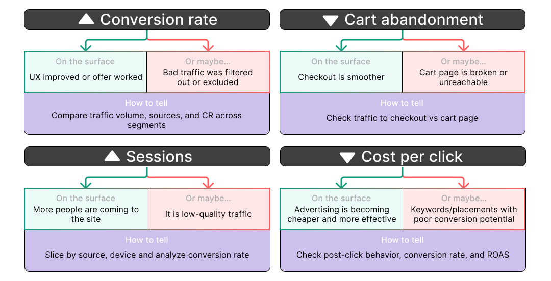
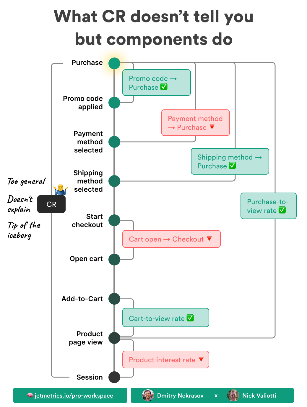
#5 Conversion Rate (CR)
Conversion Rate shows the percentage of sessions that result in a desired action, like a purchase.
Conversions ÷ Total sessions × 100
What it seems to say:
Your site is doing a better job converting visitors to buyers.
Why it might be misleading:
It can improve simply because traffic quality changed — e.g., low-quality users were filtered out.
How to read it right:
Compare CR across channels, devices, and user types.
Track traffic volume alongside CR to avoid survivorship bias.
#6 Cart Abandonment Rate
Cart Abandonment Rate shows how often users add to cart but don’t complete the purchase.
1 − (Completed purchases ÷ Carts created) × 100
What it seems to say:
Fewer users are dropping off at the final step.
Why it might be misleading:
The cart page might be broken or inaccessible, so fewer people reach it at all.
How to read it right:
Compare traffic to cart vs. traffic to checkout.
Watch abandonment rate in combination with absolute flow volume.
#7 Sessions
Sessions count the number of times users visit your site, regardless of how many pages they view.
One session = one visit (measured by analytics tools)
What it seems to say:
Traffic is growing — more users are visiting your site.
Why it might be misleading:
That traffic might be irrelevant, accidental, or poor quality (e.g. bots, wrong geo, etc.).
How to read it right:
Segment by traffic source, device, campaign, and landing page.
Check CR or engagement rate per segment to detect bad volume.
#8 Cost per Click (CPC)
CPC tells you how much you pay, on average, for each ad click.
Total ad spend ÷ Number of clicks
What it seems to say:
Your ads are getting cheaper — great efficiency!
Why it might be misleading:
You might be buying cheaper clicks from low-converting audiences or keywords.
How to read it right:
Look at post-click metrics: bounce rate, time on site, CR, and ROAS.
Track CPC together with quality and intent signals.
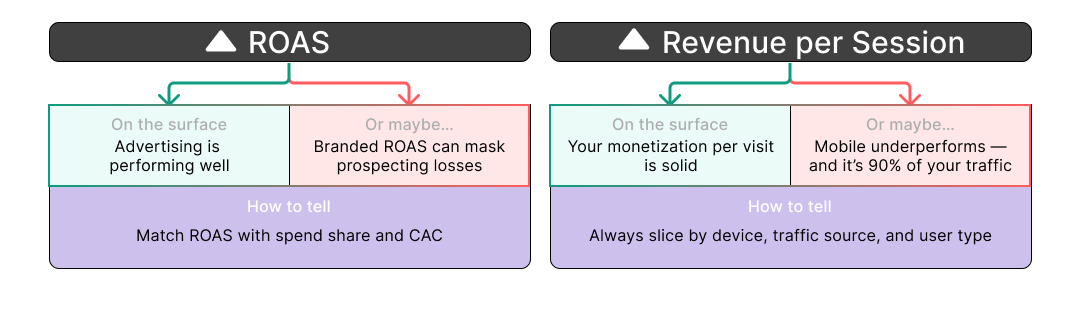
#9 Return on Ad Spend (ROAS)
ROAS shows how much revenue you earn for every dollar spent on advertising.
Revenue from ads ÷ Total ad spend
What it seems to say:
Advertising is performing well — you’re making more than you spend.
Why it might be misleading:
High ROAS from branded or retargeting campaigns can hide losses in prospecting.
How to read it right:
Break down by campaign type (branded, remarketing, prospecting).
Match ROAS with spend share and CAC.
#10 Revenue per Session
Revenue per Session shows how much revenue, on average, you earn from each visit.
Total revenue ÷ Total number of sessions
What it seems to say:
Your monetization per visit is solid.
Why it might be misleading:
It might be skewed by segments — e.g., desktop users perform well, but 90% of traffic is on mobile, where performance is poor.
How to read it right:
Always slice by device, traffic source, and user type.
Watch both the revenue and the volume that segment contributes.
Reading Metrics with Context: A Simple Guide
A metric is not the truth. It’s just a signal.
Metrics don’t lie to you — but they can easily mislead you if you look at them without context.
A rising number might feel like progress. A drop might feel like failure. But both can be false signals if interpreted in isolation.
That’s why metrics should never be viewed alone.
To truly understand what’s happening in your business, you need to look at the relationships, the segments, and the behavior behind the numbers.
Here are a few ways to do that:
Look at the full chain
No metric works in isolation. If CR is up, ask why — is it because product views are up? Add to carts? Checkout flow improved?
Always segment your metrics
First-time vs returning. Mobile vs desktop. Paid vs organic. High AOV customers vs low.
The average hides more than it reveals.
Watch volume, not just rates
A great performance in a small slice of traffic might not move the needle.
A bad metric in your biggest segment might hurt you more than it seems.
Add behavioral context
Numbers are outcomes — enrich them with behavior: scroll depth, click rate, bounce flow, page time.
This helps separate real engagement from surface noise.
Read metrics like a conversation — not like a scoreboard.
And always ask: why did this change? what does it mean underneath?
Final thought
Most metrics don’t lie.
But they also don’t explain.
They need context. Relationships. Segments. Behavior.
That’s where real insights live.
Next time a number looks too good (or too bad) — don’t stop at the number.
Ask: why did this happen, and what does it really mean
LinkedIn post of the week
Dashboard of the week
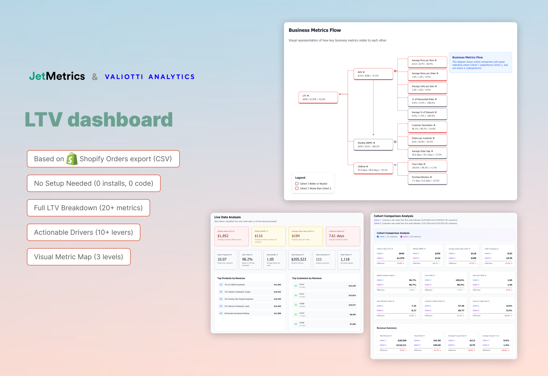
LTV Map for Shopify: now live
We built a new tool based on metric maps — this time focused on LTV.
Upload a simple Shopify export, pick two cohorts, and explore what’s really driving your customer lifetime value.
It’s free to use — no setup needed.
Just data in, insights out.
Happy analyzing 🫶
See you next week!
Dmitry from JetMetrics