


Table of contents:
Article
Post of the week
Dashboard of the week
15 hidden patterns from metrics overlap
Sometimes two metrics are enough to reveal a hidden story. You check the dashboard — and the numbers start talking to each other.
Traffic goes up while scroll depth drops. Carts get bigger but fewer reach checkout. LTV climbs while margins sink.
Each overlap sparks a question — and behind every question, a set of hypotheses worth testing.
Here are 15 metric overlaps with 3 hypotheses each — 45 ideas you can test straight away.
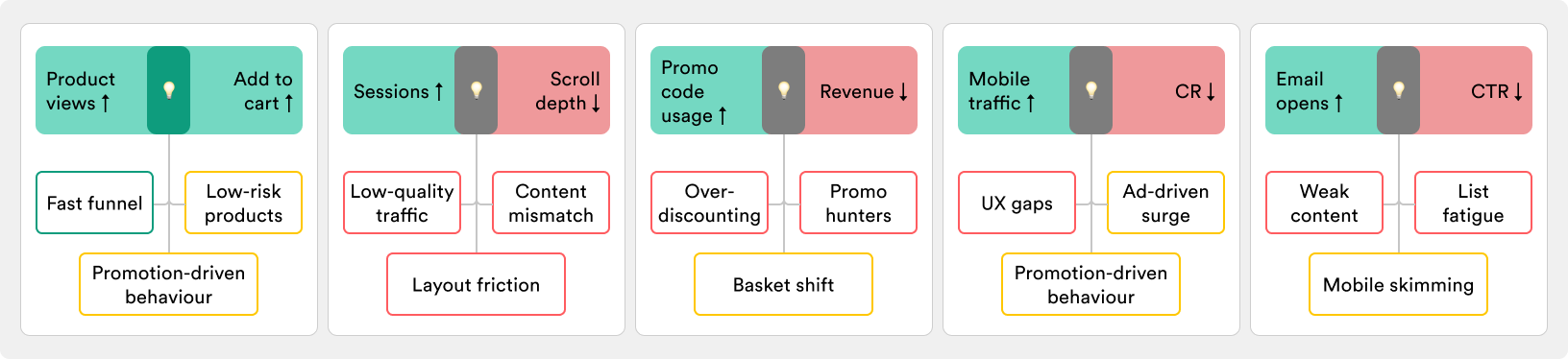
Product views ↑ + Add to cart ↑
Users are exploring more products and adding them to carts at a higher rate — interest and intent seem to move in sync.
Possible hypotheses:
Fast funnel — shoppers are finding what they need quickly; check if it’s broad or just a few hero items.
Promotion-driven behavior — discounts or campaigns push people to act faster; see if the spike fades after promo ends.
Low-risk products — easy, low-cost items invite quick adds; monitor if cart value actually grows.
Sessions ↑ + Scroll depth ↓
More people are visiting, but they scroll less once they land — traffic is up, engagement per session is down.
Possible hypotheses:
Low-quality traffic — new visitors come from weak channels; check paid campaigns or SEO spikes.
Content mismatch — pages don’t match intent, so users stop early; review landing page relevance.
Layout friction — key info sits too far down; test moving value props or CTAs higher.
Promo code usage ↑ + Revenue ↓
Shoppers are redeeming more discount codes, yet overall revenue is dropping — more orders, but less money left on the table.
Possible hypotheses:
Over-discounting — margins erode as promos cut too deep; check if revenue per order is shrinking.
Promo hunters — customers wait for codes and avoid full-price buys; see if full-price sales decline.
Basket shift — shoppers use codes on cheaper items; track whether AOV is sliding down.
Mobile traffic ↑ + CR ↓
Mobile sessions are growing, but fewer of them end in purchase — traffic climbs, conversions slip.
Possible hypotheses:
UX gaps — checkout or navigation is harder on mobile; review funnel drop-offs by device.
Attracting casual browsers — mobile brings less intent-driven traffic; compare add-to-cart rates vs desktop.
Ad-driven surge — mobile campaigns boost visits but not quality; check if paid channels skew mobile-heavy.
Email opens ↑ + CTR ↓
More people open your emails, but fewer click through — attention stops at the subject line.
Possible hypotheses:
Weak content — subject lines work, but body copy or offers don’t; A/B test message framing.
List fatigue — subscribers skim but don’t act; segment engaged vs dormant users.
Mobile skimming — many opens happen on phone; optimize layout and CTAs for small screens.
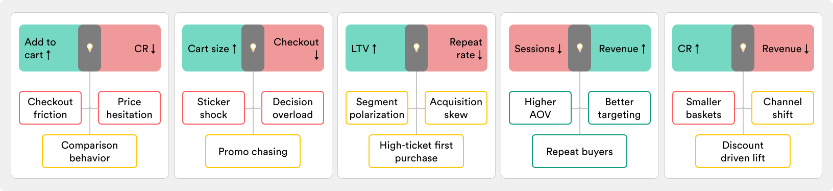
Add to cart ↑ + CR ↓
More items make it into carts, but fewer sessions end in purchase — intent sparks, but stalls before checkout.
Possible hypotheses:
Checkout friction — payment, shipping, or forms stop users; audit drop-offs at each step.
Price hesitation — customers reconsider total spend; test messaging on value or free shipping thresholds.
Comparison behavior — shoppers use carts as wishlists; see if cart-to-checkout time is growing.
Cart size ↑ + Checkout ↓
Carts are getting bigger, but fewer of them actually make it through checkout — people load up, then hesitate.
Possible hypotheses:
Sticker shock — high totals scare buyers off; test installment options or shipping incentives.
Decision overload — too many items create doubt; check if larger carts convert worse than small ones.
Promo chasing — users add more just to reach thresholds; monitor if they abandon when discounts don’t apply.
LTV ↑ + Repeat rate ↓
Customer lifetime value is rising, but fewer customers are coming back — higher spend per buyer, but less loyalty overall.
Possible hypotheses:
High-ticket first purchase — some customers spend big once, then leave; check cohort behavior after first order.
Segment polarization — a small group buys a lot while most drop off; analyze distribution of spend.
Acquisition skew — new customers churn faster, old ones lift LTV; separate cohorts by acquisition period.
Sessions ↓ + Revenue ↑
Traffic is falling, but total revenue is climbing — fewer visitors, yet stronger monetization.
Possible hypotheses:
Higher AOV — fewer shoppers, but they spend more; confirm with basket size trends.
Better targeting — low-intent traffic dropped off, leaving high-quality buyers; check channel mix.
Repeat buyers — loyal customers sustain revenue despite less new traffic; review new vs returning split.
CR ↑ + Revenue ↓
Conversion rate improves, but overall revenue declines — more visitors buy, yet the money coming in shrinks.
Possible hypotheses:
Smaller baskets — shoppers convert but spend less; track AOV alongside CR.
Channel shift — growth comes from low-value segments; compare revenue per user across sources.
Discount-driven lift — promos boost CR but cut revenue; review margin and order value trends.
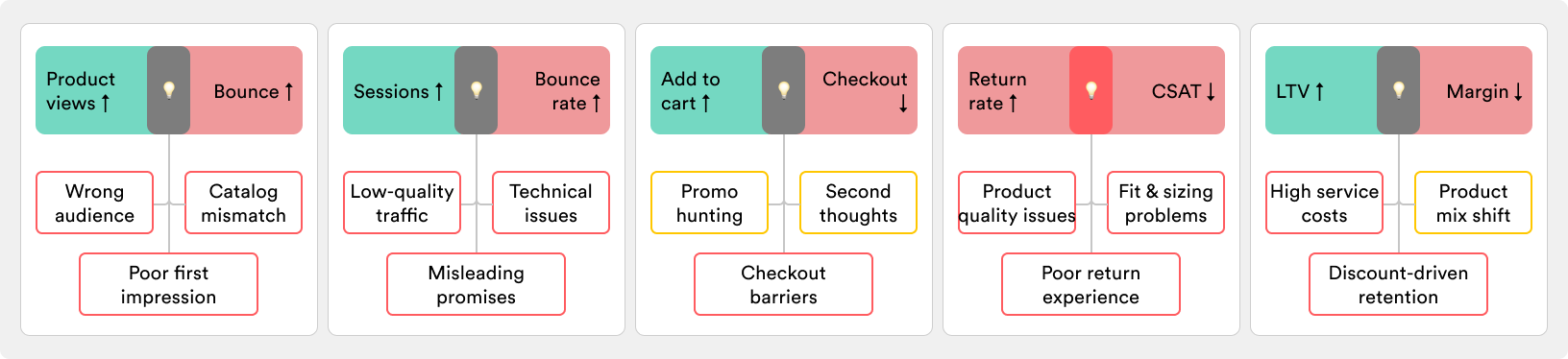
Product views ↑ + Bounce ↑
Shoppers open more product pages, but leave right after — curiosity rises, commitment doesn’t.
Possible hypotheses:
Wrong audience — traffic grows, but it’s the wrong fit; review targeting and acquisition channels.
Poor first impression — product pages load slow or fail to convince; check bounce by device and speed.
Catalog mismatch — people browse, but items don’t meet expectations; compare popular entry points vs exits.
Sessions ↑ + Bounce rate ↑
Traffic is increasing, but more users leave after just one page — visits grow, depth shrinks.
Possible hypotheses:
Low-quality traffic — campaigns or SEO bring clicks without intent; review sources with highest bounce.
Misleading promises — ads or snippets set wrong expectations; check if landing content matches entry keywords.
Technical issues — slow load or broken layouts push users away; segment by device and browser.
Add to cart ↑ + Checkout ↓
More products make it into carts, but fewer sessions reach checkout — intent starts strong, but stalls mid-funnel.
Possible hypotheses:
Checkout barriers — shipping costs, account creation, or payment limits block progress; analyze drop-offs by step.
Promo hunting — users add items while searching for discounts; track cart abandonment vs promo activity.
Second thoughts — shoppers hesitate on value or need; test nudges like guarantees or urgency near checkout.
Return rate ↑ + CSAT ↓
More orders are being sent back, and customer satisfaction is falling — frustration rises alongside returns.
Possible hypotheses:
Product quality issues — items don’t meet expectations; review complaints and defect rates.
Fit & sizing problems — especially common in fashion; track return reasons and update guides.
Poor return experience — the process itself feels slow or painful; audit return policies and customer support.
LTV ↑ + Margin ↓
Customers are spending more over time, but profit margins are shrinking — revenue grows, profitability falls.
Possible hypotheses:
Discount-driven retention — repeat buyers are locked in by promos; check if margin loss tracks with loyalty gains.
High service costs — loyal customers require perks like free shipping or support; review cost-to-serve per order.
Product mix shift — returning customers favor low-margin items; analyze contribution margins by cohort.
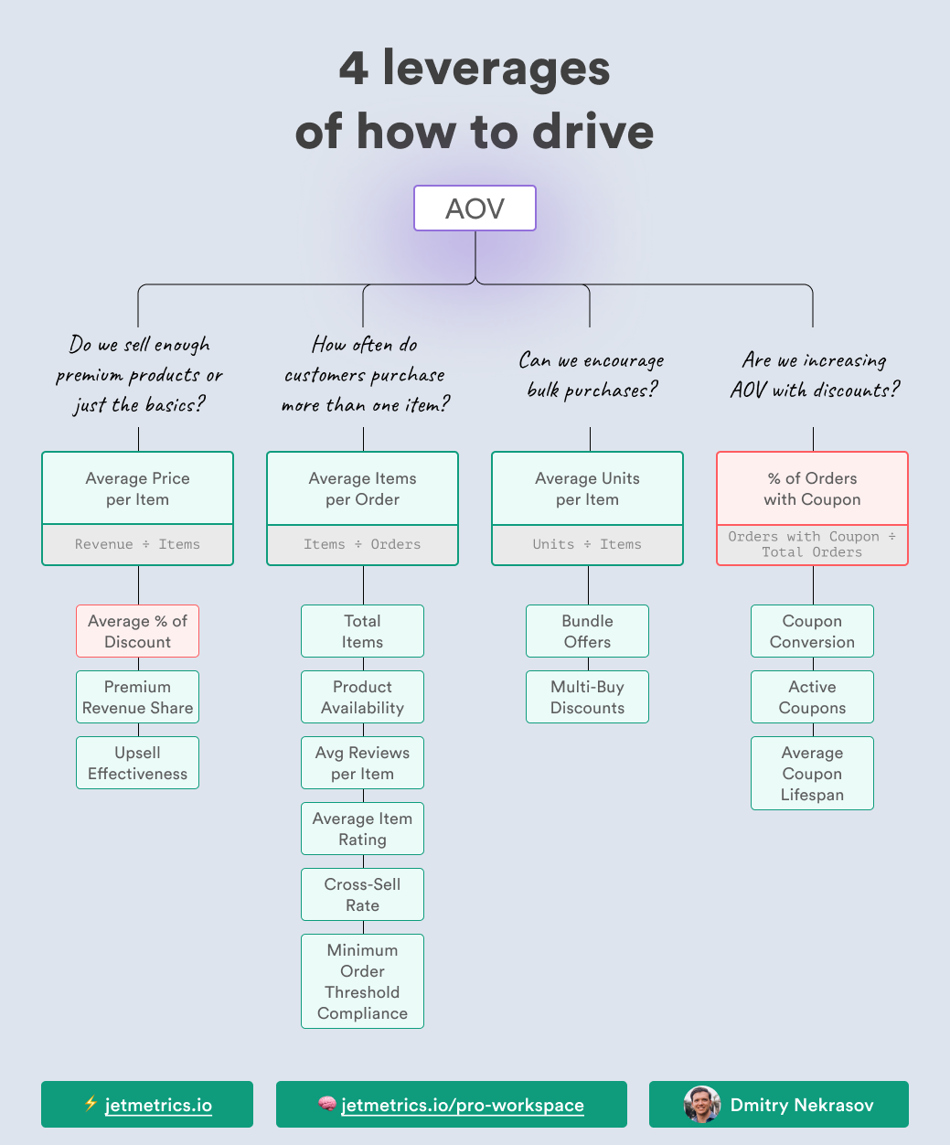
Final thoughts
These 45 hypotheses won’t give you the full truth — but they give you a place to start. Your business may follow a different pattern, but every investigation needs an entry point.
Our brains crave simple explanations. Use these overlaps as the first step: generate ideas, test them, and let the data guide you further.
The key is not to wait for perfect answers — it’s to start moving.
LinkedIn post of the week
Dashboard of the week
We’ve just updated the Google Ads Performance Dashboard — now it’s even easier to spot what’s working and what’s wasting budget.
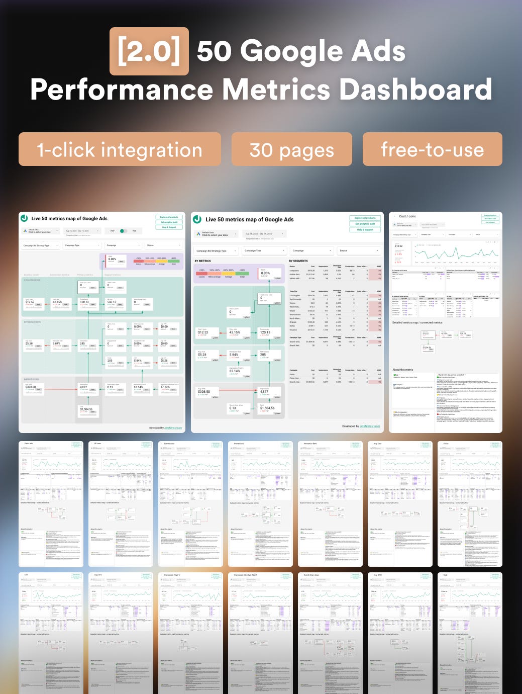
The update brings the long-awaited ROAS metric with color-coding (green = efficient, red = wasted), plus new comparison modes (PoP + YoY) to see both short-term shifts and seasonal trends.
We’ve also added a combo view: mini-map + key breakdowns by device, geo, and campaign type, so you get the full picture at a glance.
Happy analyzing 🫶
See you next week!
Dmitry from JetMetrics