

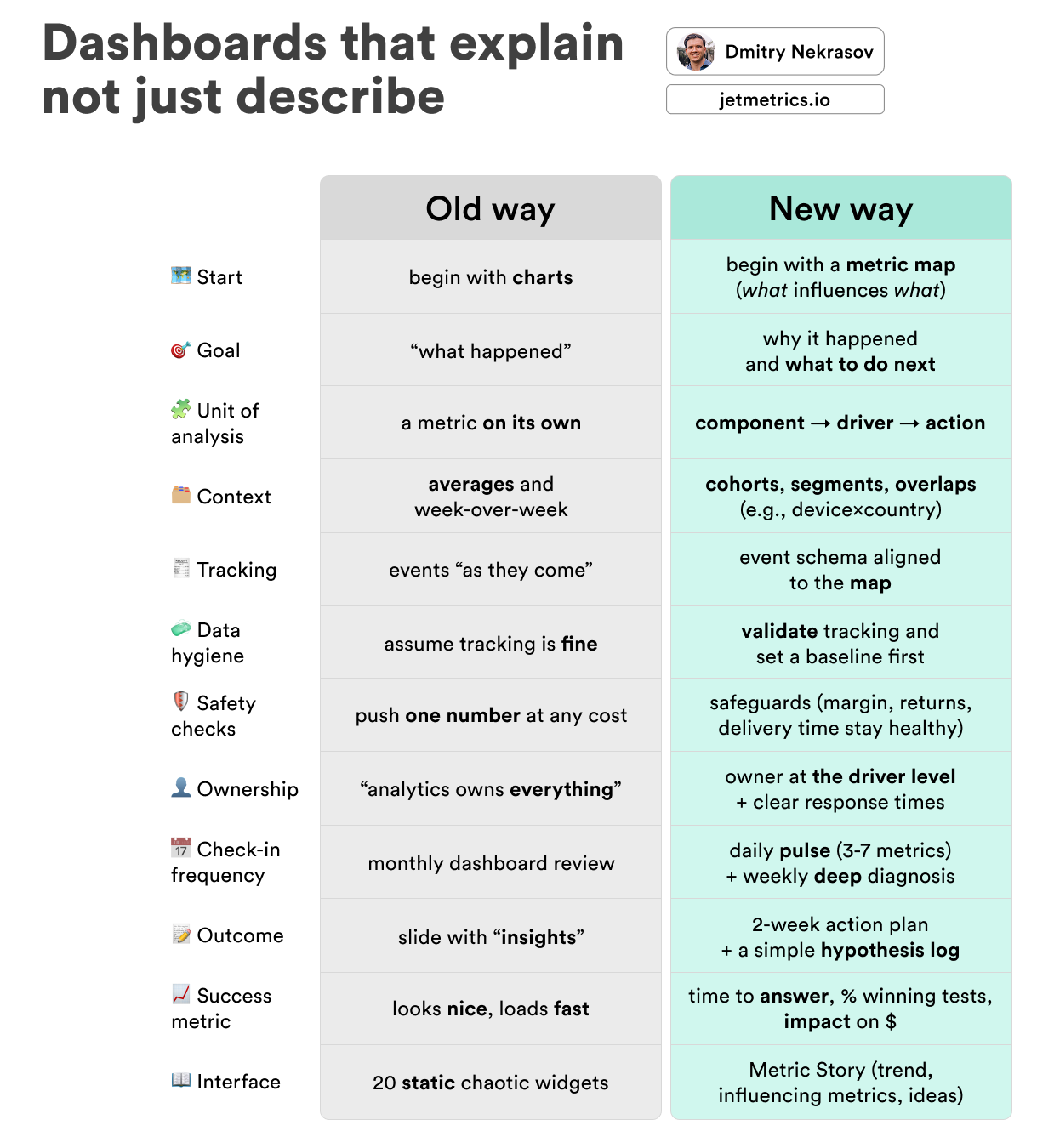
25 Quick A/B Tests You Can Try Today
Idea fuel for your store — small experiments to queue up next | JetMetrics Weekly #016

Table of contents:
JetMetrics App update
Article
Post of the week
Update of the week
JetMetrics App weekly update
🙌 Metric migration: 100% done
All metrics have now been moved to the new flow.
Charts and breakdowns too.
We’re now testing everything to catch the last small bugs.
Feels like we’re almost at the finish line — we’re wrapping up the switch to the new infrastructure, and once it’s live, you’ll feel the speed difference.
Check out the product’s roadmap – https://jetmetrics.io/roadmap
JetMetrics is currently in a closed beta. Book a 1:1 demo to connect Shopify store.
25 Quick A/B Tests You Can Try Today
Your roadmap needs fuel — ideas. Testing never stops: when it’s bad, you fix; when it’s good, you squeeze more.
So here’s a pack of small, ready-to-run A/B tests you can pull from anytime — quick switches, clean reads, zero drama.
This shortlist is based on our larger 225 A/B test library covering creatives, email, pricing, checkout, and more.

Image Subject — single vs. group
Category: Ad Creatives
Goal: CTR ↑
What if a small “squad” of products catches more attention than a solo hero? Try testing how variety in one frame changes click behavior.
A = single hero
B = group shot (3–5 items)
⚡ Fast to try: Skip the design queue — use an AI collage tool like Canva Magic Design or Magic Studio to build a quick group image from existing photos — no designer wait time, takes under a minute.
❗ Heads up: Keep products big enough to recognize; if they start blending into background noise, reduce to three.
Testimonial Inclusion — benefits vs. customer quote
Category: Ad Creatives
Goal: CTR ↑
Think your own words sell best? Try letting your customers do the talking — a tiny quote might outshine your “10 reasons why.”
A = ad with benefits only
B = ad with a customer testimonial
⚡ Fast to try: Don’t overthink it — grab the snappiest line from a 5-star review and drop it in. No reviews yet? Ask your last 3 buyers for one sentence.
❗ Heads up: Keep it short and human — if it reads like your marketing team wrote it, it won’t work.
User-Generated Content vs. Professional Ad — polished vs. real
Category: Ad Formats
Goal: CTR ↑
Does a glossy studio shot really win clicks — or do people trust a bit of chaos from real customers more? Let’s see what feels more “real” to your audience.
A = professional product photos
B = user-generated photos or videos
⚡ Fast to try: Grab a few tagged posts from your brand’s Instagram or TikTok and run them as ads. It’s the fastest “authenticity test” you’ll ever launch.
❗ Heads up: Check for brand fit — raw is good, messy isn’t. Keep lighting and tone consistent enough to still feel like you.

Button vs. Text CTA — click or scroll
Category: Email Content
Goal: Conversion Rate ↑
Does a bold button drive more clicks than a subtle text link — or do people trust a quieter, less “salesy” cue? Time to find out which call actually calls.
A = CTA as a button (e.g., “Shop Now”)
B = CTA as a text link
⚡ Fast to try: Duplicate your last campaign, swap the CTA format only, and hit send to a 50/50 split. No new copy, no design time — pure signal test.
❗ Heads up: Make sure your text link doesn’t hide in the background — if people have to squint to find it, the test is already lost.
Inclusion of Social Proof — stats vs. silence
Category: Email Content
Goal: Conversion Rate ↑
Does a little bragging help — or does it scare people off? Try adding that “10,000+ happy customers” line and see if trust beats humility.
A = no social proof
B = includes social proof (e.g., “Over 10,000 customers love this!”)
⚡ Fast to try: Add one simple proof point to your best-performing email — number of customers, reviews, or total orders. Keep it in one line; no case study required.
❗ Heads up: Don’t fake it — if your number looks suspiciously round or outdated, it’ll backfire fast.
Curiosity-Driven Subject — straight vs. tease
Category: Email Subject Lines
Goal: Open Rate ↑
Will a little mystery make people click — or just roll their eyes? Test if curiosity beats clarity when it comes to getting that first open.
A = “Our new collection is here!”
B = “You won’t believe what’s just arrived…”
⚡ Fast to try: Take your next launch email and rewrite the subject with one open loop — swap “available now” for something that hints, not tells.
❗ Heads up: Don’t cross into clickbait — if the reveal doesn’t match the tease, you’ll lose trust (and future opens).
Emojis in Subject Line — plain vs. playful
Category: Email Subject Lines
Goal: Open Rate ↑
Can one tiny emoji make your subject pop — or just make it look like spam? Let’s see if your audience loves a little flair or prefers it clean.
A = “Don’t miss our latest offers”
B = “🔥 Hot deals you can’t miss!”
⚡ Fast to try: Add a single emoji that fits your tone — one, not five. Start with something safe (🔥, 🎉, 💌) and watch the open-rate lift.
❗ Heads up: Emoji fatigue is real — too many and you’ll look like a scam ad from 2012.
Personalization in Subject Line — generic vs. name drop
Category: Email Subject Lines
Goal: Open Rate ↑
Does seeing their own name make people click faster — or do they smell automation from a mile away? Time to find out.
A = “Check out our new collection!”
B = “John, your new favorite styles are here!”
⚡ Fast to try: Add first-name tags in your next campaign — most email tools do it in two clicks. Send to a small test segment first to check formatting.
❗ Heads up: Make sure every contact actually has a name in your list — “Hey ,” is the fastest way to kill a test (and a mood).
Personalized Send Time — same-time vs. smart-time
Category: Email Timing
Goal: Conversion Rate ↑
Do your subscribers click more at breakfast or bedtime? Test if sending at each person’s local peak time beats blasting everyone at once.
A = emails sent at the same time for all recipients
B = emails sent based on each recipient’s time zone
⚡ Fast to try: Most email platforms have “send by time zone” — turn it on for half your list and compare results after two sends.
❗ Heads up: Keep enough volume per group — if your list is small, splitting by time zone might blur results instead of clarifying them.
Pre-Event Timing — early vs. last call
Category: Email Timing
Goal: Conversion Rate ↑
Should you tease a sale days in advance — or hit inboxes right before it starts? Test if early planners or last-minute shoppers drive more revenue.
A = email sent 2 days before a sale
B = email sent 6 hours before a sale
⚡ Fast to try: Clone your next promo email — schedule one batch early, one close to launch, and watch which gets more clicks (and fewer “I missed it!” replies).
❗ Heads up: If your sale window is short, don’t wait too long — sending too late can mean people see it after it’s over.

Discount on First Purchase — % off vs. free gift
Category: Discounts and Coupons
Goal: Conversion Rate ↑
What’s a stronger hook for new customers — money off or a little something extra in the box? Let’s find out which one wins first-time hearts.
A = “10% off your first order”
B = “Free gift with your first order”
⚡ Fast to try: Run both as pop-ups or welcome emails — just swap the incentive. It’s the same flow, same copy, only the carrot changes.
❗ Heads up: Make sure the free gift actually feels like a gift — if it’s a sticker or coupon, people will roll their eyes.
Flash Sale Type — BOGO vs. 50% off
Category: Discounts and Coupons
Goal: Add-to-Cart Rate ↑
Do shoppers love the feeling of getting something free — or is a straight discount clearer? Test which framing sparks faster clicks.
A = “Buy 1, Get 1 Free”
B = “50% off on second item”
⚡ Fast to try: Duplicate your flash sale banner or email — keep timing and visuals identical, just swap the offer format.
❗ Heads up: Watch your margins — BOGO looks exciting but can cut deeper than a 50% deal if carts stay small.
Tiered Discount Levels — single vs. stacked
Category: Discounts and Coupons
Goal: AOV ↑
Does one simple discount do the job — or do shoppers spend more when there’s a ladder to climb? Time to test the psychology of “unlocking more.”
A = “10% off orders over $50”
B = “10% off $50, 15% off $100, 20% off $200”
⚡ Fast to try: Use your existing promo setup — just add two extra tiers and see if customers stretch their cart to reach the next one.
❗ Heads up: Keep tiers realistic — if your jump from $100 to $200 feels out of reach, people won’t bother climbing.
Psychological Price Ranges — just above vs. just below
Category: Pricing
Goal: Conversion Rate ↑
Does $49 feel cheaper than $51 — even if it’s basically the same? Test if the classic “.99 magic” still works for your audience.
A = products priced just above whole numbers ($51)
B = products priced just below whole numbers ($49)
⚡ Fast to try: Pick 5–10 mid-range items, round half up and half down, and watch which batch converts better over a week.
❗ Heads up: Don’t use it everywhere — if every price ends in 9, it’ll look like a discount store, not a brand.
Time-Limited Pricing — calm vs. countdown
Category: Pricing
Goal: Conversion Rate ↑
Does adding a ticking clock spark action — or just stress people out? Test if urgency actually drives faster checkouts.
A = standard pricing
B = limited-time discount with countdown timer
⚡ Fast to try: Add a 24-hour countdown banner or timer widget to your next sale page — same offer, different pressure.
❗ Heads up: Don’t keep restarting the timer — shoppers notice, and once they do, the trust (and urgency) is gone.
Limited Quantity Display — unlimited vs. capped
Category: Psychological Techniques
Goal: Add-to-Cart Rate ↑
Does showing a “limit per customer” make people act faster — or make them suspicious? Try framing scarcity as fairness and see what happens.
A = products without quantity limits
B = displayed limit (e.g., “Limit 2 per customer”)
⚡ Fast to try: Add a simple “Limit X per order” line to product pages or carts — no redesign needed, just a small text tweak.
❗ Heads up: Use it sparingly — if everything suddenly has a limit, shoppers will smell a trick.
Low Stock Indicator — plenty vs. almost gone
Category: Psychological Techniques
Goal: Add-to-Cart Rate ↑
Does a little FOMO push people to act — or does it feel manipulative? Test if showing “Only 3 left” turns browsers into buyers.
A = no stock indicator
B = “Only 3 left in stock!” displayed
⚡ Fast to try: If your platform tracks inventory, show low-stock labels automatically once quantity drops below 5.
❗ Heads up: Keep it real — fake scarcity might work once, but it’ll kill trust (and repeat purchases) fast.
Urgent Shipping Deadline — anytime vs. now-or-never
Category: Psychological Techniques
Goal: Conversion Rate ↑
Does adding a delivery deadline nudge people to buy today — or just add pressure? Let’s see if urgency drives more checkouts.
A = standard shipping information
B = “Order within X hours for delivery tomorrow”
⚡ Fast to try: Add a simple countdown banner near the “Add to Cart” button — update it dynamically based on your daily cutoff time.
❗ Heads up: Be honest with timing — if the promised delivery slips, you’ll win the conversion but lose the customer.

Product Badge Usage — clean vs. highlighted
Category: Product Display
Goal: Conversion Rate ↑
Do little badges like “Best Seller” or “New” actually guide shoppers — or just clutter the grid? Test if subtle hints boost clicks to key products.
A = no badges on products
B = display badges like “Best Seller” or “New”
⚡ Fast to try: Tag a few top-performing products and add badges manually — you can start with 5–10 items to see if they attract more attention.
❗ Heads up: Don’t badge everything — once every item is “Top Rated,” nothing really is.
Product Information Display — minimal vs. detailed
Category: Product Display
Goal: Add-to-Cart Rate ↑
Do shoppers need just the basics — or do ratings help them decide faster? Test how much info to show before they click through.
A = show only product title and price
B = show title, price, and rating
⚡ Fast to try: Add star ratings or review counts under titles for a subset of products — no layout changes needed.
❗ Heads up: Make sure your ratings data is solid — one bad average or fake-looking score can tank trust instantly.
Default Sorting Option — popularity vs. price
Category: Sorting and Filters
Goal: Add-to-Cart Rate ↑
Should shoppers see your bestsellers first — or the cheapest deals? Test which list order makes more people start adding to cart.
A = default sorting by popularity
B = default sorting by price (low to high)
⚡ Fast to try: Change the default sort setting for half your traffic — no design or copy edits, just a backend tweak.
❗ Heads up: Cheap-first sorting can hurt AOV — if you lead with low margins, people might never scroll up to the premium stuff.

Testimonial Placement — bottom vs. near CTA
Category: Content and Copywriting
Goal: Conversion Rate ↑
Do testimonials work better as the grand finale — or right when people are about to decide? Test where trust matters most.
A = testimonials at the bottom of the page
B = testimonials near the CTA
⚡ Fast to try: Duplicate your landing page, drag the testimonial block just above the CTA, and run a 50/50 split.
❗ Heads up: Don’t overload the moment — one or two short quotes near the CTA are plenty. Too much text and the scroll dies there.
Points Expiry Notifications — gentle vs. urgent
Category: Loyalty Programs
Goal: Repeat Purchase Rate ↑
Do customers act faster with a polite reminder — or only when their points are about to vanish? Let’s test which nudge gets them moving.
A = notification sent 7 days before points expiry
B = notification sent 1 day before expiry
⚡ Fast to try: Duplicate your standard reminder flow — just shift the timing to 24 hours before expiry and measure redemptions that day.
❗ Heads up: Don’t overdo the pressure — if every message screams “last chance,” customers will start tuning out.
Birthday Reward Type — gift card vs. discount
Category: Loyalty Programs
Goal: AOV ↑
Which birthday treat works better — a fixed-value gift card or a juicy percentage off? Let’s see what makes people celebrate with a bigger cart.
A = $10 gift card for birthday
B = 20% discount on birthday purchases
⚡ Fast to try: Keep both in the same birthday flow — split customers randomly and track not just redemptions, but order values.
❗ Heads up: Make sure your discount feels like a reward, not a marketing trick — if it’s worse than your regular promo, you’ll kill the vibe.
Location-Based Offers — global vs. local
Category: Dynamic Content
Goal: Conversion Rate ↑
Does a touch of local flavor make people click more? Try swapping your one-size-fits-all promo for something that feels closer to home.
A = generic discount offer
B = localized offer (e.g., “Free delivery in New York!”)
⚡ Fast to try: Use your store’s geo-data or shipping regions — duplicate the same offer but tweak city names or delivery perks for each location.
❗ Heads up: Don’t over-segment — if your copywriter spends three hours writing 20 city versions, the test will cost more than it earns.
Final thoughts
Keep testing, keep moving — small experiments stack up fast.
Measure them right: pick one primary metric, set a clear run window, compare like-for-like segments, and log the decision.
When these start feeling too easy, the full 225 A/B test library is there to dive deeper — same idea, just more fuel for your next round.
LinkedIn post of the week
Update of the week
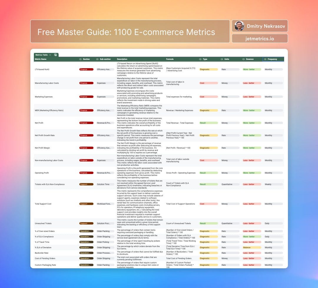
We’ve just launched the E-commerce Metrics Master Guide — 1100 metrics across 21 key business areas. From marketing and sales to logistics and finance — everything you need to measure, optimize, and grow.
Each metric includes a clear definition, formula, and tags — so you always know what drives performance.
Happy analyzing 🫶
See you next week!
Dmitry from JetMetrics