Table of contents:
Article
Guide of the week
Post of the week
JetMetrics App update
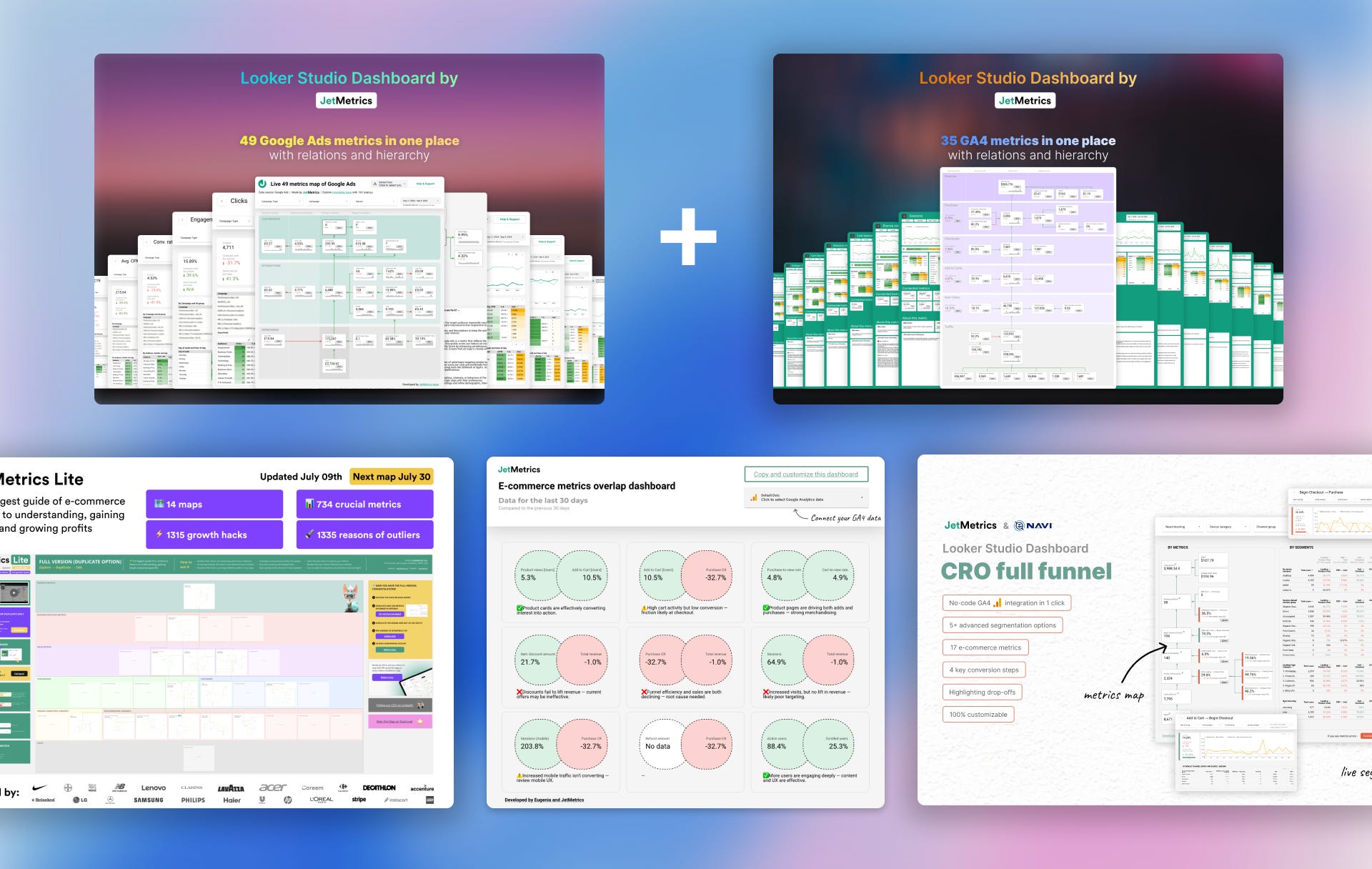
[Promo] All-in-one bundle with $620 discount
When something goes wrong in a business (sales drop, profit shrinks, retention slips), everyone opens the dashboards.
What we usually see is a page full of metrics. Revenue, AOV, LTV, ROAS, Conversion Rate. Each with its own number, trendline, maybe a percentage change. Most dashboards are built like this: a collection of isolated indicators, designed to monitor.
But as soon as a number goes red, the monitoring stops helping.
You start asking: what changed? Why? Where’s the root cause?

And that’s where things fall apart because most dashboards don’t answer those questions. They’re not built to explain. They don’t show how metrics interact.
They don’t show structure.
So the team enters guesswork mode.
Someone blames the checkout experience.
Someone else says the traffic quality dropped.
🙋♀️ Another person points to seasonality or a recent email campaign.
And now, instead of clarity, you’re in a two-hour Slack thread with ten opinions and no plan.
The core problem is this: we treat metrics like isolated facts. But in reality, every metric lives inside a system of relationships. And if you don’t see or understand those relationships, your analysis turns into storytelling. Some stories are close to the truth. Some are complete fiction. But in both cases, it’s not a reliable basis for decisions.
Not all relationships between metrics are the same
Even when teams try to find connections between metrics, they often treat all relationships as equal. One metric changed, another metric changed — therefore, one must have caused the other.
In practice, it’s rarely that simple.
Some metrics are connected by formulas.
Some influence others through user behavior.
Some change earlier or later in time.
Some move in sync because of a shared driver.
And some just happen to move together, without any real connection at all.
If you treat all of these the same, you’ll end up explaining a drop in conversion rate by a rise in email open rate, or worse, making decisions based on patterns that aren’t patterns.
This happens more often than you’d think.
We’ve seen experienced marketers misattribute growth to the wrong campaign. We’ve seen teams spend hours chasing “insights” that turned out to be statistical noise. And we’ve seen plenty of people optimize metrics that had zero influence on their actual business goals.
To avoid that, it helps to know what kind of relationship you’re looking at. Below are five types of metric relationships we’ve identified, along with examples from real e-commerce scenarios.
Some of them are useful. Some are misleading. And some are dangerous if you act on them blindly.
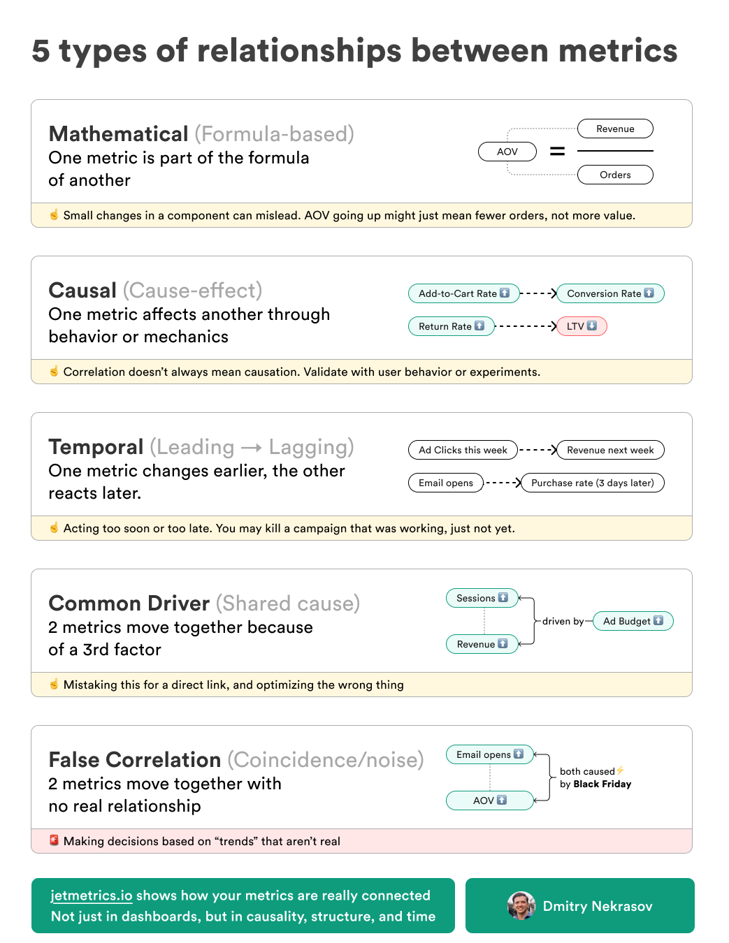
1. Mathematical (formula-based relationships)
This is the most direct and obvious type of connection: one metric is a mathematical component of another. You’ll see this in ratios and composite metrics.
Take AOV, for example:
AOV = Revenue / Orders
Let’s say your AOV increased by 9%. It might look like customers are spending more per order. But then you check the data and realize that revenue stayed flat, and the number of orders simply dropped.
The change in AOV didn’t come from user behavior or improved value per purchase. It’s just arithmetic. That’s not growth, it’s a symptom of something else.
Another case: LTV.
LTV = Repeat Purchase Rate × Retention × ARPC
This formula is common in retention-driven brands. But when LTV moves, you have to break it down. Maybe ARPPU went up slightly because of a few high-ticket purchases, while retention dropped. So the net effect looks neutral or slightly positive, but in reality, the long-term signal is negative.
The trap here is that a change in a formula-driven metric can be either a real signal or just the result of a structural shift in one of its components. If you don’t check, you’ll celebrate something that isn’t working or miss an early warning.

2. Causal (cause-and-effect relationships)
Some metrics change because of actual cause-and-effect mechanics either in the product, in marketing, or in user behavior.
These are the most actionable relationships, but only if they’re real.
For example, imagine you simplify your checkout. You reduce the number of fields from 12 to 6, remove unnecessary steps, and make it mobile-friendly. After the update, you see that cart abandonment dropped by 18%.
That’s a causal relationship. The behavior changed because the experience changed.
Another example: you introduce a clearly displayed free shipping threshold. Customers who previously ordered one or two items now consistently add more to reach the minimum.
The result? A measurable increase in AOV.
Causal relationships are where you want to operate as a team. These are the ones you can influence. But the danger is assuming a cause where none exists, like thinking your loyalty program is increasing retention, when in fact it’s just targeting the customers who were loyal anyway.
That’s why having context and structure matters. It helps you separate real levers from convenient guesses.
3. Temporal (leading and lagging relationships)
Some metrics don’t change at the same time. One moves first, and the other responds later. This time delay creates a different kind of trap: either assuming a campaign isn’t working (because you checked too early), or giving credit to the wrong factor (because something changed before the real impact landed).
Here’s a common scenario: you send a promotional email on Monday morning. By the afternoon, open and click rates look good. But sales haven’t moved yet. By Tuesday, your team starts questioning whether the offer was strong enough. On Wednesday, revenue spikes. People were just taking the time to convert.
If you had made changes too early, like pulling the campaign, tweaking the landing page, or shifting the segment, you would’ve disrupted something that was actually working.
Another example: a new ad campaign brings a spike in traffic. Conversion rates don’t immediately respond. But 3–4 days later, as those visitors return, repeat view products, and check out, the results become clear.
This type of lag is especially common in higher-consideration categories (furniture, supplements, multi-item bundles) and in returning customers.
Misreading this relationship often leads to killing good ideas too soon or overestimating tactics that just got lucky with timing.
4. Common driver (shared influence)
This is one of the most misleading types of relationships: two metrics move together, but not because one caused the other. They’re both reacting to a third factor.
For instance, suppose your sessions and revenue both increased by 20% last week. You might think traffic is converting better, or that your CRO work paid off.
But in reality, the increase in both metrics came from a spike in ad spend. You pushed a campaign harder, and as a result, more people came, and more people bought. That doesn’t mean sessions caused revenue. It means both were driven by the same thing.
Another example: you see returning user rate and conversion rate go up simultaneously. Looks promising, like retention is driving purchases. But it turns out that your latest email campaign brought back loyal customers with a promo code. They were going to convert anyway.
These relationships create a false sense of insight. They feel intuitive. They’re easy to present in a slide. But they’re not necessarily levers. If you optimize based on these kinds of correlations, like focusing on returning users instead of improving your email targeting, you’ll invest in surface-level patterns instead of root causes.
5. False correlation (coincidence)
This one looks like a pattern, but it isn’t.
Sometimes two metrics move in sync, both go up or down around the same time, and it feels like there must be a connection. But there isn’t. It’s just a coincidence. A byproduct of timing, seasonality, or pure noise.
You see this a lot around major events. Say it’s Black Friday. Your email open rate spikes. Your AOV also increases. Someone on the team connects the two: “People are engaging more, so they’re spending more.”
But in reality, everything is up. Open rate, AOV, sessions, conversion rate, revenue. It’s not one causing the other. It’s just the effect of an external event.
Another case: your sessions went up last week, and your add-to-cart rate improved slightly. You assume that better traffic brought better intent. But a closer look shows that the session spike came from a random mention on Reddit, a segment that behaved differently for a few days, then disappeared.
False correlations are dangerous because they waste time. They look like insights. They create confidence. But if you act on them, adjusting campaigns, changing strategy, you’re optimizing against randomness.

Why this matters
Understanding these relationships isn’t a theoretical exercise. It’s what separates useful analysis from noise.
When teams don’t recognize these patterns, they:
Waste time debating the wrong causes
Try to fix the wrong problems
Overreact to temporary noise
Miss deeper issues hiding under surface-level changes
We’ve seen this in real companies, from fast-growing DTC brands to experienced agencies. The same problems come up again and again: slow investigations, mismatched explanations, and action plans built on assumptions.
If you want to move fast, make better decisions, and show the real impact of your work, you have to understand how metrics actually interact.
Closing thought
Tracking metrics is easy. Building dashboards is easy.
But understanding what drives what, and making better decisions because of it… That’s the hard part.
That’s the part most teams struggle with.
And that’s the part we’re trying to fix.
Guide of the week
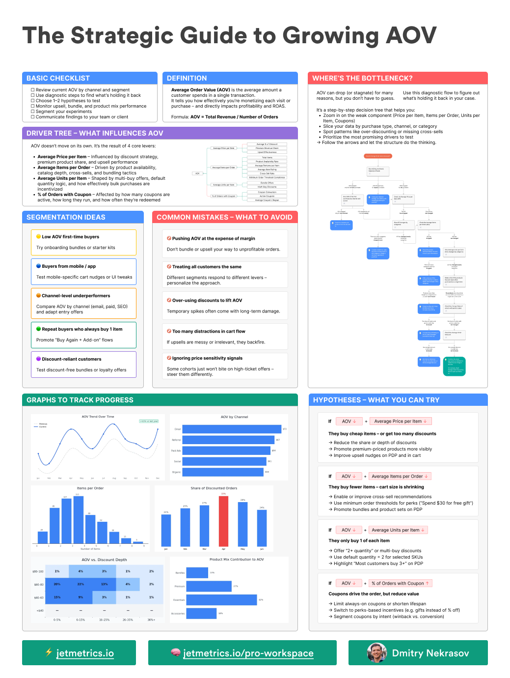
This guide is a part of our next big thing — JetMetrics Workspace
Here’s what’s inside the guide:
Checklist – how to review the current AOV
Driver Tree – visual breakdown of what influences AOV
Algorithm – a flowchart to zoom in on weak spots
Hypotheses – what to test depending on your numbers
Common Mistakes – like sacrificing margin
Graphs to Track – real examples to monitor AOV drivers
Segmentation ideas – from discount-hunters to multi-basket buyers
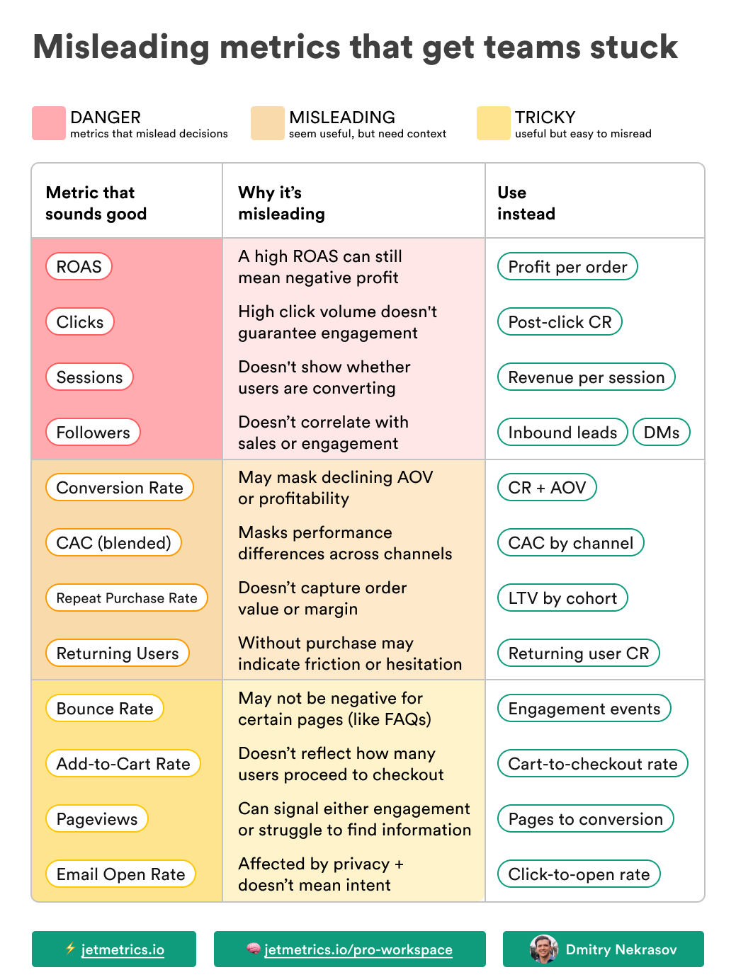
LinkedIn post of the week
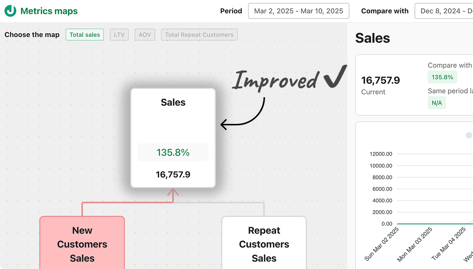
JetMetrics App weekly update
We improved the Total sales metric. Now, all calculations mirror Shopify’s logic.
Why this matters:
No more mismatched numbers when comparing with Shopify.
Easier to explain results to your team or clients.
Clean, transparent data for better decisions.
Check out our public roadmap – https://jetmetrics.io/roadmap
JetMetrics is in a closed beta now. Book a 1:1 demo to connect your Shopify store.
Promo
We often get messages like:
“I’m buying multiple dashboards — any chance for a better deal?”
That’s exactly why we created the JetMetrics Bundle — to make it easier (and cheaper) to get everything at once.
It already saves you $436 compared to buying separately.
This week, we’re going one step further:
An extra 25% off the full bundle — all dashboards + our knowledge base. That’s over $620 total savings.
Just use code: JETS25