


Table of contents:
JetMetrics App update
Article
Post of the week
Upcoming update
JetMetrics App weekly update
🔧 Still working under the hood
Last week, we started rebuilding how JetMetrics handles data in the background.
This week, we’ve finalized the new structure for store data and are now working on customers and products — orders come next.
Not something you’ll see just yet, but it's part of making JetMetrics faster and more reliable as we grow.
Check out the product’s roadmap – https://jetmetrics.io/roadmap
JetMetrics is currently in a closed beta. Book a 1:1 demo to connect Shopify store.
6-step framework to quickly pinpoint why your metric dropped
You notice a key metric has dropped.
You already know what’s coming — a long dive into reports, endless filters, and the hope you’ll eventually land on the cause.
It doesn’t have to be this way.
Here’s a 6-step framework we use to quickly get from “the number’s down” to “here’s why”.
And to make it clearer, we’ll walk through each step on a real dashboard built by Anastasia Kuznetsova.
How this guide works
We use a simple 6-step framework to find the reason behind a metric change — without the chaos. The cheat sheet version got great feedback, so here we’re pairing each step with a quick, real-data demo in an interactive dashboard. You’ll see what to check, in what order, and how it looks in practice.
Theory — the idea behind the step and what to verify.
Example — the same step shown on our Profit Ratio dashboard.
By the end, you’ll have a repeatable path from “metric moved” to “here’s why.”
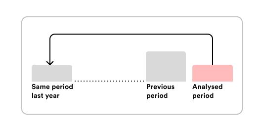
Step 1 – Make sure the drop is real
Theory
Not every dip in your metrics means trouble. Sometimes it’s just seasonality, last year’s promo, or a random spike smoothing out.
Before you go full detective mode, check if the drop is actually worth chasing:
Compare YoY, not just to the previous month.
Look for promos, holidays, or weird one-offs.
Make sure your data isn’t late or glitchy.
Think of it like taking your temperature: maybe you’re sick… or maybe you just had a hot coffee.
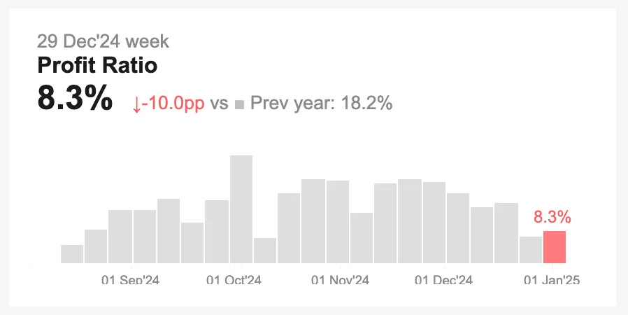
Example
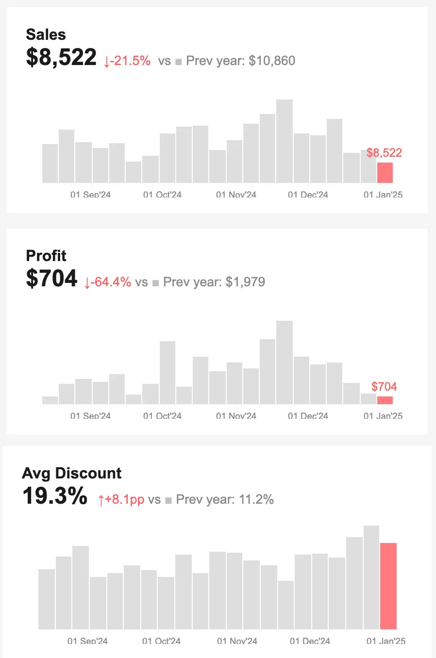
In our Profit Ratio dashboard, the weekly trend showed:
A steady decline for several weeks.
A –10pp YoY drop.
No promos or anomalies last year during this period.
Conclusion? It’s not noise — it’s a real change, and it’s worth digging deeper.
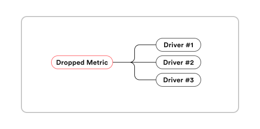
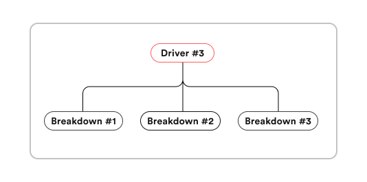
Step 2 – Break the metric into drivers
Theory
Your key metric is just the end result — to understand it, you need to know what’s holding it up.
Drivers are the smaller metrics that directly form your main one. They can come straight from a formula (e.g., Revenue = Orders × AOV) or from the underlying logic of how that metric works.
Good drivers:
Are directly measurable.
Can change independently of each other.
Actually influence the key metric in a clear, mathematical way.
Usually 2–3 drivers are enough. More than that, and you’re drowning in detail before you even start.
Example
For Profit Ratio, the formula is:
Profit Ratio = Profit ÷ Sales
That gives us two obvious drivers: Profit and Sales. But we also add Avg Discount — it’s not in the formula, but it directly eats into Profit by reducing margins.
So our driver set is: Profit, Sales, and Avg Discount. These will be the suspects we investigate in the next step.
Step 3 – Look at the trend of each driver
Theory
Now, check how each driver has been moving over time.
You’re looking for:
Which one changed the most.
Whether the change was sudden or gradual.
If the change matches the timing of your key metric drop.
The idea is simple: if one driver is tanking while others are steady, you’ve found your main lead.
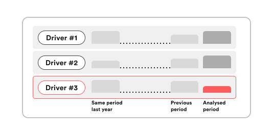
Example
In our Profit Ratio case:
Profit dropped –64%.
Sales dropped –21%.
Discounts jumped +8%.
Even without going further, it’s clear margins (via higher discounts) are playing a big role in the decline — and we’ll dig into where exactly in the next step.
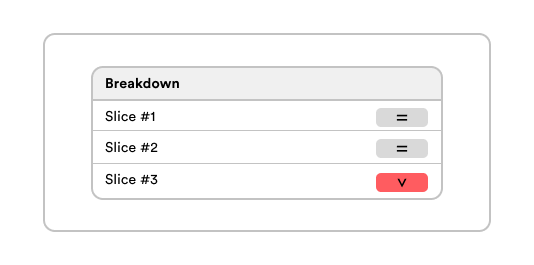
Step 4 – Break down the affecting metric
Theory
Now that you know which driver actually moved (from Step 3), slice that metric (and, if helpful, the key metric alongside it) to locate the hotspot. Start broad → then narrow.
Where to break it down:
Customer/market: segment (B2B/B2C), new vs returning, region/country.
Product: category, SKU, price band, discount band.
Acquisition/UX: channel/campaign, device, landing page.
Time: cohorts, promo periods, weekday/weekend.
Make your dashboard work for you:
Highlight big moves — use color to flag drops and gains so they pop instantly.
Show segment size — a huge % change in a tiny slice probably won’t move the needle.
Enable cross-filters — click a segment to see every other view filtered to it.
Show related metrics together — place the main metric and its key drivers in the same breakdown view.
Example
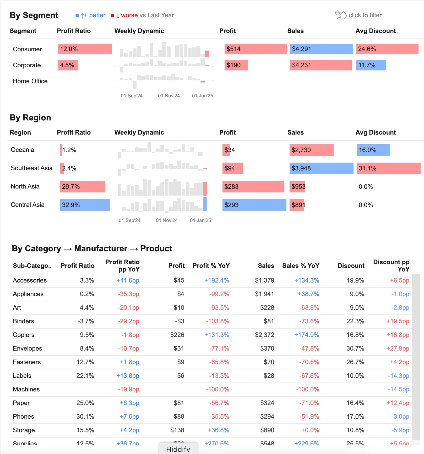
Here, we take our Step 3 suspects — Profit and Avg Discount — and look at them across four breakdowns: Segment, Region, Category, and Product.
The dashboard is built for this kind of search: each view shows the key metrics side-by-side, their YoY change, and a small weekly trend chart, with red/blue highlights to flag negative and positive shifts. This makes it easy to scan, click into a segment, and immediately see where the problem is clustering.
Step 5 – Compare segments
Theory
In Step 4, we chose the breakdowns to explore.
Now, look inside each breakdown and find the weakest segments — the rows where your key metric and its main drivers show the largest drop.
These are the places where the decline is most visible and worth focusing on.
The outcome of this step: a shortlist of problem segments that clearly stand out from the rest.
Example
In practice, it’s best to review these findings together with your hypotheses — we’ll do that in the next step.
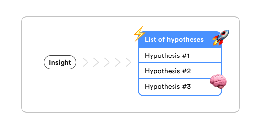
Step 6 – Turn findings into hypotheses
Theory
Take the weak segments you found in Step 5 and ask:
What could be causing the drop?
What else should we check to confirm?
What can we try to improve it?
Turn these into 1–3 clear, testable hypotheses for each segment.
This is where you move from “here’s where it’s bad” to “here’s what we think is going on and how to fix it.”
Example
By segment:
Corporate: Profit –86% YoY, Sales –37%. Discounts slightly lower, so price cuts aren’t the main issue. Filtering this segment showed several regions — including Oceania, the top by sales — where Profit is negative.
→ Likely a cost or pricing structure problem in high-volume regions, effectively selling at a loss.
Consumer: Profit –13%, but discounts up +17pp.
→ Likely margin erosion from aggressive promos — check if extra sales covered the lost profit.
By region:
Southeast Asia: Sales +250% YoY, but Profit –63% and Profit Ratio –20pp, with discounts up +12%.
→ Deep discounting likely erased margins despite volume growth — check if cuts were necessary or applied too broadly.
By category/product:
Appliances: Profit –99% YoY with no discount change.
→ Pricing may be too close to cost, leaving no room for profit.
Binders: Profit –104% YoY, discounts up +20pp.
→ Promotions may have exceeded optimal profitability thresholds — test discount levels vs. sales lift.
Art: Profit –94% YoY with stable discounts.
→ Likely a demand issue — check traffic and conversion to this category.
What’s next
Once you’ve got your hypotheses, prioritise them. Pick the ones most likely to have an impact and easiest to test with the resources you have.
Run those tests, measure the results — and then come back to the dashboard.
Update the data, check the metrics again, and repeat the process.
That’s the beauty of this framework: it’s not a one-off fix, it’s a loop you can use any time a metric changes. And if you’d like to see the full example in action, here’s the interactive dashboard we used in this walkthrough. You can click around, explore the breakdowns, see how the metrics change, and maybe pick up a few ideas for your own dashboards.
Big thanks to Anastasia Kuznetsova for building it.
LinkedIn post of the week
Coming Soon: Google Ads Pulse Dashboard
We’re wrapping up the final design for our new Google Ads Pulse Dashboard — built for quick, no-hassle tracking of Google Ads results. Perfect for in-house teams and for client reporting if you work agency-side. Launching next week — stay tuned!
In the meantime, we’re always happy to hear your feedback on our current dashboards or ideas for new ones.
Happy analyzing 🫶
See you next week!
Dmitry from JetMetrics
Thanks! Love the breakdown.