


Table of contents:
JetMetrics App update
Article
Post of the week
JetMetrics App weekly update
🚀 First speed tests on the new infrastructure
This week, we ran the first data load tests on the new backend — and the results are promising.
Products and orders are now importing through the new system, and early benchmarks show it's already 10 times faster than before.
It’s the first real step from architecture to action — and a sign of what’s coming next.
Check out the product’s roadmap – https://jetmetrics.io/roadmap
JetMetrics is currently in a closed beta. Book a 1:1 demo to connect Shopify store.
9 mistakes that kill the value of analytics
In analytics, the biggest mistakes don’t happen in formulas — they happen in how we think about metrics.
That’s why teams so often make “smart” decisions that look good on paper but quietly burn money in practice.
We collected 9 fundamental mistakes that come up again and again. Here’s what to check in your own reporting first
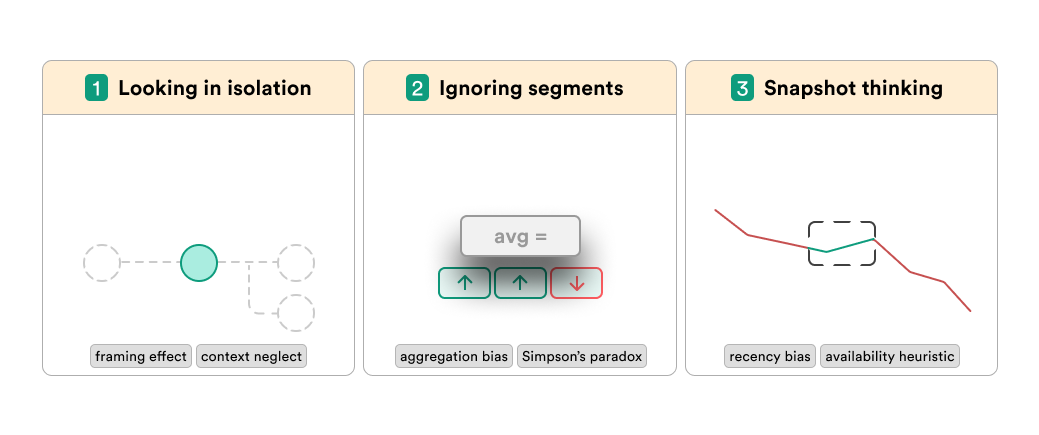
1. Looking in isolation
When you look at a metric on its own, it’s easy to mistake a symptom for the cause or to celebrate a “local” improvement while the business shrinks.
Classic example: AOV goes up, but CR drops and total orders fall. Or CR declines with stable traffic, when the real issue is Add to Cart. Optimizing one slice in isolation often hurts the bigger picture.
💡 How to avoid it
Start with the flow. Place the metric in its chain (Sessions → PDP views → Add to Cart → Checkout → Purchase). Ask: where does the first real drop happen?
Measure the impact. Compare the scale of changes. If ATC is down 18% but CR only 6%, the cart step is the real leak.
Step back to the system. Use supporting metrics (Items per session, Checkout start rate, Drop-offs by step) to confirm what’s broken — and to make sure you’re fixing the cause, not the side effect.
2. Ignoring segments
Looking only at the overall number hides the fact that different groups of customers behave very differently.
A 3% CR can look “fine,” but that average might mean 8% for returning customers and just 0.5% for new ones. Without segmentation, you risk fixing what isn’t broken — and missing what is.
💡 How to avoid it
Split by basics first. Check new vs returning, desktop vs mobile, and key channels. These cuts already show where performance really breaks down.
Dig into product or basket segments. Compare AOV by product category, or cart size by acquisition channel. Often one weak category or traffic source drags the whole average down.
Prioritize fixes by segment impact. Don’t chase the overall 3% CR. If 70% of your traffic is new users converting at 0.5%, that’s the real problem — not the 8% returning rate.
3. Snapshot thinking
Looking at a single period in isolation gives a false sense of stability.
An average CR of 3% over two months might look “steady,” but if it was 5% in month one and 1% in month two, performance actually collapsed. Snapshots blur the trend and make you react too late.
💡 How to avoid it
Always compare periods. Check current vs previous month or week to catch early signs of decline.
Look at the trend, not the point. Use moving averages or simple charts to see the direction — not just one data cut.
Validate with cohorts. Instead of one blended number, follow how different customer groups evolve over time. This reveals if the drop is recent, seasonal, or structural.
4. Overfocusing on 1 metric
Treating a single number as the ultimate truth is risky. Metrics like CR, AOV, or LTV look solid at the top — but each one is built from smaller pieces. If you chase only the headline, you’ll miss the weak links underneath and end up fixing the wrong thing.
💡 How to avoid it
Break it into components.
– CR = product views → add-to-cart → checkout start → purchase.
– AOV = items per order × price per item.
– LTV = purchase frequency × order value × lifetime.
Find the weakest driver. A flat CR may hide a drop in add-to-cart; a “healthy” AOV may mask shrinking basket size; strong LTV averages may rely on a small cohort of loyal buyers.
Optimize the pieces, not the poster number. Work on the weakest driver and watch how the overall metric changes — that’s where durable growth comes from.
5. No context
A metric number on its own rarely means anything. A 3% CR, $60 AOV, or $300 LTV might look “good” — but compared to what? Without context like benchmarks, time trends, or external factors (seasonality, traffic mix, pricing changes), you can misread the number completely.
💡 How to avoid it
Always anchor to comparisons. Look at the trend vs last week, last month, or last year. Flat numbers can hide collapse or growth.
Bring in external factors. AOV up after price changes is different from AOV up during holiday season. Context explains why a number moved.
Use benchmarks and peers. A 3% CR in fashion ≠ 3% CR in luxury. Compare against relevant baselines, not a random “industry average.”
6. Correlation = causation
Just because two metrics move together doesn’t mean one caused the other. Traffic might spike the same week AOV grows, but it could be seasonality, not ads. Retention might improve as email volume rises, but maybe it’s a new product line. Assuming cause from correlation is a shortcut that often leads to wrong bets.
💡 How to avoid it
Stress-test the link. Check if the relationship holds across segments or time periods. If it breaks in half your data, it’s not a real driver.
Look for alternative explanations. Ask “what else changed at the same time?” Campaigns, seasonality, stock levels, pricing — any of these could explain the move.
Prove with intervention. Run a test, change one input, and see if the outcome follows. Without an experiment or at least a clear natural variation, you can’t call it causation.

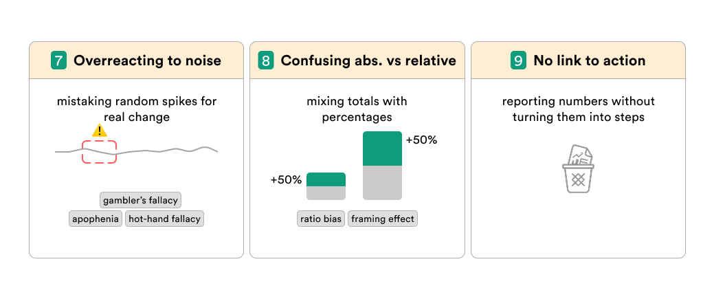
7. Overreacting to noise
Not every bump in the chart means something. Small fluctuations happen all the time — random traffic swings, a few big orders, or day-of-week effects. If you treat every wiggle as a signal, you’ll waste time chasing ghosts and burning resources.
💡 How to avoid it
Check the sample size. A 20% drop in conversion sounds scary — until you see it came from just 12 sessions.
Smooth the view. Use 7-day or 30-day windows to separate random noise from real shifts.
Define thresholds. Decide upfront what level of change is “actionable.” AOV moving ±2% may be natural variation; ±15% is worth digging into.
8. Confusing abs. vs relative
A 50% growth rate sounds huge — but if it’s from 2 orders to 3, it means nothing. The opposite also happens: a flat “+1% CR” might hide thousands of extra orders. Mixing up absolute and relative changes makes results look bigger (or smaller) than they really are.
💡 How to avoid it
Always show both. Report the percentage change together with the absolute numbers. “CR up +1% = 1,200 extra orders.”
Scale the impact. Ask what the change means in revenue, customers, or margin — not just in percentages.
Compare like with like. A 10% lift in a small channel isn’t equal to 10% lift in your main one. Weight results by their real contribution.
9. No link to action
A metric that can’t drive a decision is just a number on a dashboard. Vanity metrics like page views, app installs, or social followers may look impressive but don’t show what to actually do next. Without a clear link to action, you end up measuring for the sake of measuring.
💡 How to avoid it
Ask “so what?” Every metric should answer a decision: change budget, test pricing, fix checkout, etc. If it can’t, it’s not actionable.
Tie to drivers. Connect top-line metrics (like LTV) to levers you can influence (frequency, basket size, retention). That’s where action lives.
Prioritize impact. Focus reporting on metrics that change strategy or tactics — not on ones that only decorate slides.
Final thoughts
Metrics don’t lie — but they also don’t speak.
It’s up to you to read them right.
Avoid these nine traps, and your analytics stops being decoration — it becomes a map that actually shows where to go next.
LinkedIn post of the week
Happy analyzing 🫶
See you next week!
Dmitry from JetMetrics