


Table of contents:
Article
Post of the week
Dashboard of the week
Averages are lying to you — here’s what to use instead
The biggest lie in analytics hides in plain sight: the average.
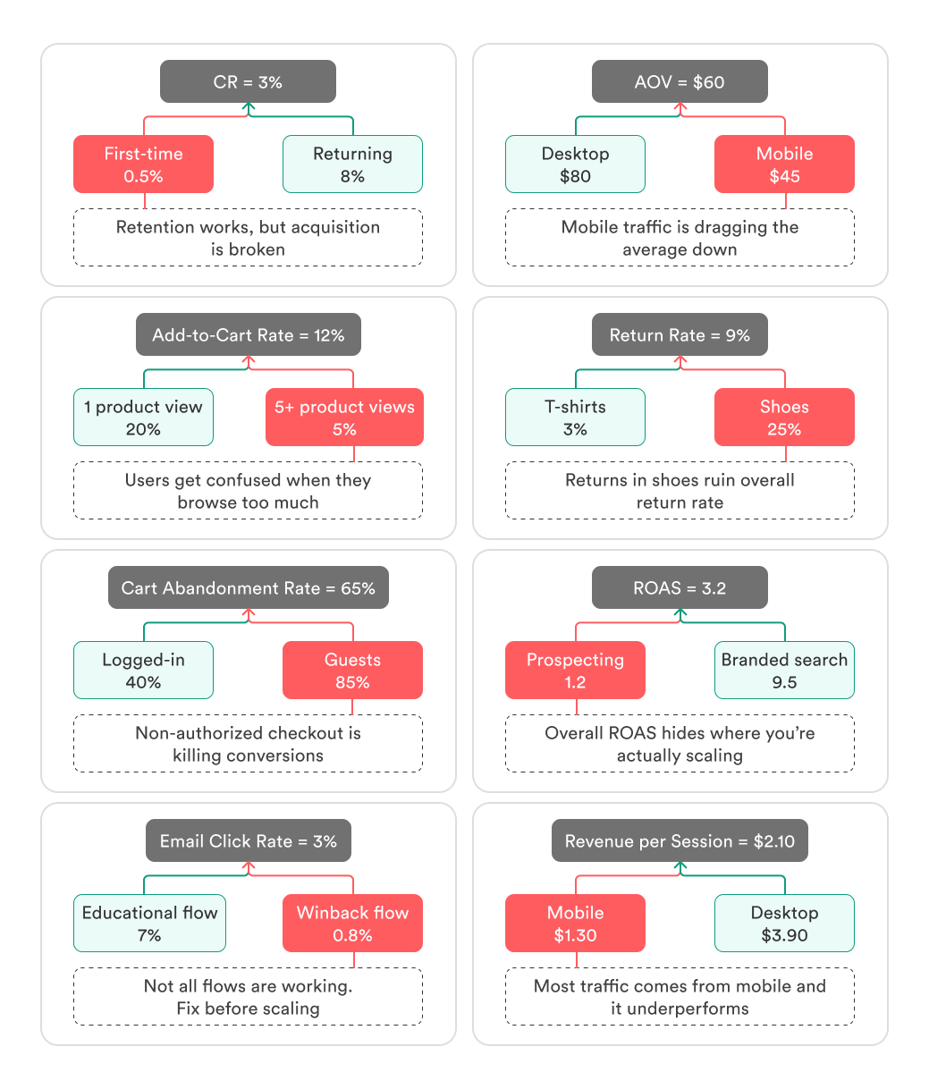
It makes your metrics look safe and simple — 3% CR, $60 AOV, $300 LTV. But those neat numbers often cover up broken acquisition, unprofitable cohorts, or products that quietly bleed margin.
The danger is clear: if you trust the average, you’ll make decisions that look smart on paper but fail in practice. The real question is — what should you look at instead?
Why averages mislead in analytics
They hide anomalies.
Imagine 100 orders: 99 of them around $50, and one crazy order of $10,000. The average AOV jumps to $150+, but in reality 99% of customers never spend anywhere near that.
They blur segments.
Say your overall conversion rate is 3%. Looks fine. But split it: returning customers convert at 8%, first-timers at just 0.5%. The average hides that acquisition is failing.
They erase dynamics.
Month 1: CR = 5%. Month 2: CR = 1%. The two-month average is 3%, which looks “stable.” But in truth, performance collapsed.
They distort long tails.
Picture order values: 40% of customers spend $20, the rest are scattered between $30 and $300, with a few big spenders at $500+. The average might land at $60, but most people are nowhere near that “average.”
Case: The LTV illusion
The team proudly reported average LTV = $300.
With a CAC of $100, it looked like a perfect 3:1 ratio.
But here’s the catch: that $300 was a blended, historic mean. Older cohorts and a handful of VIP customers pulled the number up. The current cohort was closer to $120–150 LTV.
Basing decisions on the average, management raised their CAC target and scaled ad spend. The result? Most new customers never paid back the cost of acquisition, and what looked like profitable growth quickly turned into negative cash flow.
That’s how an innocent-looking average can push you into the wrong move. So what should you look at instead, if you don’t want to get fooled? Let’s break down the better options.
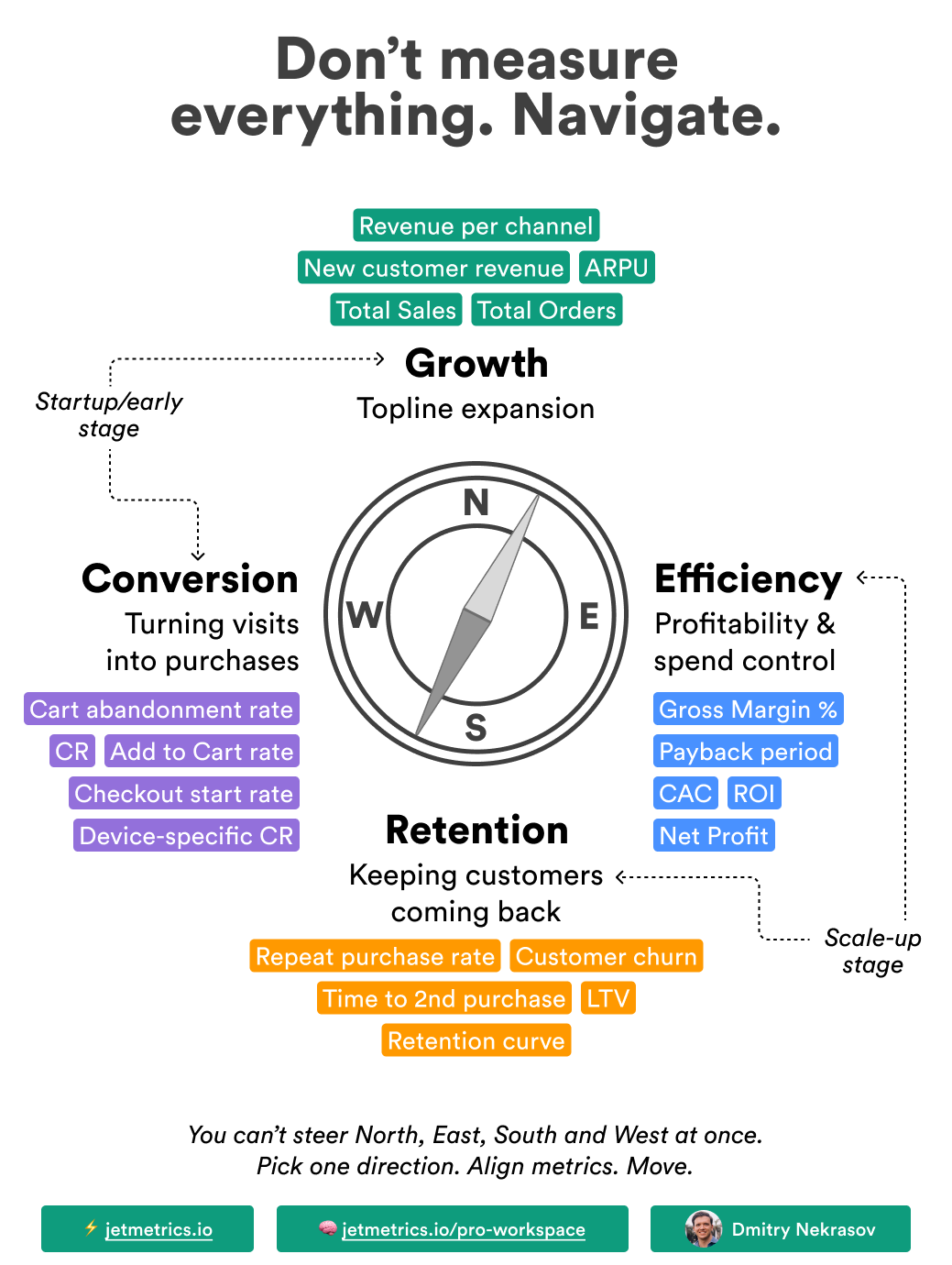
What to use instead of averages
The good news is, you don’t need anything exotic. A few simple tools will give you a much clearer picture — and stop you from making “profitable on paper, losing in real life” decisions.
Segmentation
Segmentation is when you stop looking at one big rolled-up number and split it into groups that matter — new vs returning customers, channel, device, product category, you name it. The point isn’t just to slice the data for fun — each group deserves its own decision.
Why it beats the average:
An “okay” overall number can hide a failing segment.
You fix what’s broken instead of messing with what works.
You can prioritize: some groups drive revenue, others just drag you down.
Example — Return Rate
Average return rate: 8% (looks fine).
By category:
Shoes → 18%
Apparel → 7%
Accessories → 3%
👉 Segmentation showed that shoes were underperforming, so instead of treating returns as a general issue, we can test fixes like clearer size charts and better product photos specifically for that category.
Distributions
Distributions show not just the mean, but how values are spread — what most customers do, where the bulk of orders sit, and how many outliers stretch the tail.
Why it beats the average:
The mean hides the shape of the data.
You see whether most customers are clustered low, mid, or high.
Outliers stop dictating the story.
Example — AOV
Average AOV: $60
Distribution:
70% of orders → $40–45
25% → $50–80
5% → $300+
👉 Distribution showed that most customers spend around $40–45, so instead of assuming a “typical” $60 order, the team can design bundles and upsells that target the real majority.
Median
The median is like a shortcut to the distribution: instead of one stretched mean, it gives you the middle point — what a “typical” customer actually experiences.
Why it beats the average:
Reflects the real center of the data.
Not distorted by outliers.
One number, but closer to reality than the mean.
Example — Time on Site
Average time: 7 minutes
Median time: 3 minutes
👉 The median showed that most visitors spend only a few minutes, so the team should investigate early drop-offs instead of assuming everyone is happily browsing for 7 minutes.
Percentiles
Percentiles let you see how customers spread across the range: what the bottom 20% do, where the middle sits, and how the top 10% behave. It’s like zooming into the distribution and putting guardrails around it.
Why it beats the average:
Shows you the tails — not just the middle.
Highlights risks (low performers) and opportunities (top spenders).
Helps set realistic benchmarks and CAC limits.
Example — LTV
Average LTV: $300
70th percentile: $120 (70% of customers are at or below $120)
90th percentile: $500 (90% of customers are at or below $500)
👉 Percentiles showed that most customers are far below the average, so instead of setting CAC by $300, the team should use $120–150 as a safer benchmark.
Cohorts
Cohort analysis means grouping customers by the moment they first purchased and tracking how their metrics evolve over time. Instead of one blended number, you see how different “generations” of customers behave.
Why it beats the average:
Shows changes in customer quality over time.
Reveals if new acquisition is weaker or stronger than old.
Helps tie results back to campaigns, seasons, or product launches.
Example — LTV
Blended LTV: $180
Q1 cohort: $250
Q3 cohort: $90
👉 Cohorts showed that recent customers are worth far less, so instead of trusting the $180 average, the team knows they must fix acquisition channels or offers that brought in the Q3 cohort.
Final thoughts
Averages feel safe because they’re simple. But in analytics, simple often means blind. One number hides anomalies, blurs segments, and gives you confidence where you should be worried.
The lesson is clear: averages don’t guide decisions — they disguise them. If you want to see what’s really happening, you need to break the number open: into segments, distributions, percentiles, cohorts.
Because in the end, the choice is this: keep chasing averages and chase illusions — or look deeper and finally see the truth in your metrics.
LinkedIn post of the week
Dashboard of the week
We’ve launched the new Google Ads Pulse Dashboard — a compact tool to keep your ad performance in check without digging through endless reports. It’s built for quick weekly or monthly check-ins and works perfectly for client reporting when you need the essentials at a glance.
You can connect your own Google Ads account for free and start using it right away.
Happy analyzing 🫶
See you next week!
Dmitry from JetMetrics