


Table of contents:
JetMetrics App update
Article
Post of the week
JetMetrics App weekly update
🔧 Still working under the hood
Over the past two weeks, we've been wiring up the new backend infrastructure we recently rebuilt. We've successfully connected our data pipeline to capture real-time updates from Shopify webhooks and resolved key technical issues that were causing data sync delays in our testing environment.
This behind-the-scenes work is part of our ongoing effort to scale JetMetrics for better performance and reliability. While JetMetrics continues to run on the existing setup, we're building the foundation for faster, more comprehensive insights coming soon.
Check out the product’s roadmap – https://jetmetrics.io/roadmap
JetMetrics is currently in a closed beta. Book a 1:1 demo to connect Shopify store.
Your CR is falling — 4 places to look first
Your Conversion Rate drops. The dashboard turns red, the team gets nervous.
Ideas fly: change the ads, add a discount, blame checkout. Everyone has a theory, but no one knows for sure.
CR never falls in a vacuum. Shoppers bounce, browse, abandon carts, hesitate in checkout. The real question is: where exactly did you lose them?
Conversion is not one number — it’s a chain of stages
To answer that question, you can’t treat CR as a single metric. It’s the outcome of a journey, with plenty of places where people can drop off along the way.
In the next section, we’ll break this journey into key stages — from the very first visit to the final payment — and look at the metrics that reveal where conversion really slips.
Bounce Rate
Bounce Rate shows how many visitors land on your site and leave without doing anything.
Bounce Rate = Bounced Sessions ÷ Total Sessions
For e-commerce, that’s brutal: if people bounce, they never even see your products. It’s like someone walking into a store, glancing at the entrance display, and leaving without stepping inside.
Bounce Rate is shaped by three main drivers:
Average Session Duration
This one’s tricky. A very short session usually means the visitor wasn’t interested at all — they came, saw nothing relevant, and left. But an extremely long session isn’t always good either. Sometimes it just means they couldn’t find what they wanted.
💡 Split session duration by device. If mobile users spend far less time than desktop, chances are it’s a mobile UX or speed problem.
Page Speed
Slow pages kill sessions before they even start. Today people expect everything instantly — TikTok, Reels, Shorts have trained us to swipe away the second something takes too long. A few extra seconds of loading can turn eager shoppers into bounces.
💡 Compare bounce across landing pages. If one page performs much worse, that’s your first place to fix.
Views per Session
In e-commerce, every product is its own page. If visitors see just one and leave, that usually means they weren’t interested in what they found — or the traffic itself wasn’t relevant. Truly engaged shoppers almost always click deeper.
💡 Look at traffic sources. If one channel drives mostly one-page sessions, you’re paying for low-intent visitors.

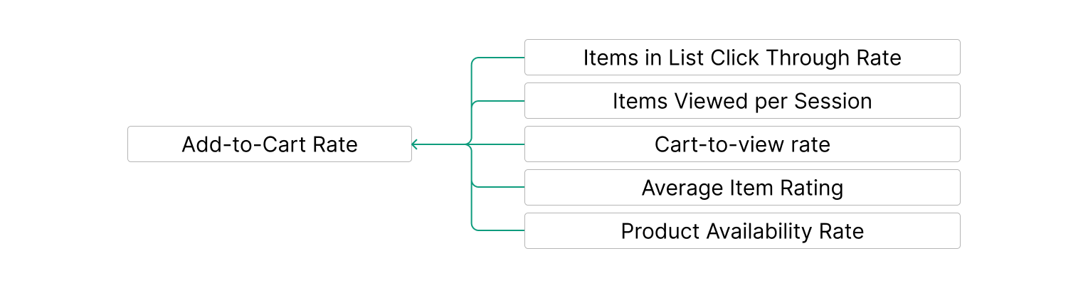
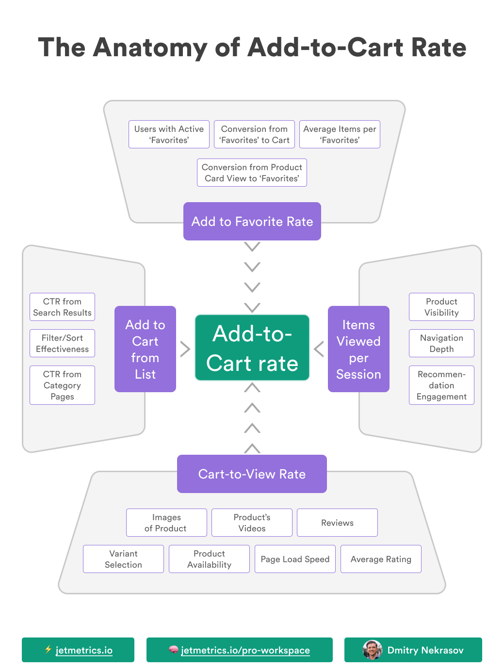
Add-to-Cart Rate
Add-to-Cart Rate shows how many visitors take the first step toward buying: they look at a product and decide to put it in the cart.
Add-to-Cart Rate = Sessions with Add to Cart ÷ Total Sessions
If this number is weak, it’s not always about “bad UX.” It usually means something along the journey didn’t spark enough intent. Let’s walk that path.
Items in List Click-Through Rate
Shoppers don’t always start in the catalog — some land on a product page right away. But when they do browse a grid of items, CTR shows if anything sparks interest. Low numbers can come from unappealing images, unclear titles, weak filters, or just traffic that wasn’t the right fit.
💡 Review what products appear first in the catalog. If your bestsellers or most engaging items aren’t showing up early, try moving them up and see if CTR improves.
Items Viewed per Session
Browsing is part of shopping. People rarely buy the first product they see — they look around, compare, maybe open three or four tabs. If visitors only view one item and leave, either navigation made it too hard to continue, or the assortment just didn’t feel relevant.
💡 Split by device. If desktop users happily explore but mobile users don’t, your mobile filters or search might be holding them back.
Cart-to-View Rate
This is about what happens after a product detail page (PDP). Do people who view an item actually add it to their cart? If not, something on the PDP isn’t persuasive enough — no reviews, poor photos, lack of a product video. Even small gaps here can break intent.
💡 Compare Cart-to-View across categories. If some product groups underperform, look for what’s missing from those pages.
Average Item Rating
Shoppers trust reviews, but not perfect ones. A wall of 5.0 scores with generic “Great product!” comments looks staged. People usually believe a mix: detailed comments, some less-than-perfect scores, and ideally photos from real buyers. That’s what makes a product page feel trustworthy.
💡 Track add-to-cart for products with photo reviews vs. those without. The gap is often surprisingly big.
Product Availability Rate
And of course, nothing kills intent faster than seeing “Out of stock.” If your most popular items aren’t available, carts will stay empty no matter how strong your pages are. Even worse, frequent “sold out” messages make shoppers stop trusting the store altogether.
💡 Monitor stock for top-selling products. If your best performers are often missing, Add-to-Cart Rate will always stay low.
Cart Abandonment Rate
Cart Abandonment Rate shows how many shoppers add products to the cart but never move further.
Cart Abandonment Rate = Abandoned Carts ÷ Carts Created
This one stings: the shopper has already liked a product enough to put it in the cart, but then… nothing. It’s like filling up a grocery basket and leaving it in the aisle.
Cart abandonment isn’t random — there are a couple of key points where people tend to drop.
Conversion to Cart View
The first question is simple: after adding an item, do people even open the cart? You’d be surprised how often they don’t. Sometimes the cart button isn’t obvious, sometimes the mini-cart feels like a dead end, and sometimes people were only “window shopping” — adding items just to check prices.
💡 Split by device. On mobile, tiny or hidden cart icons often lead to adds that never turn into a cart view.
Checkout Engagement
Opening the cart doesn’t guarantee moving forward. This is the moment where hidden shipping costs, unclear return policies, or just too many extra clicks can scare people away. The cart is a decision point: if shoppers hesitate here, checkout never even starts.
💡 Look at drop-off right after cart view. If numbers collapse here, check for surprises — fees, shipping, or anything that feels like “fine print.”

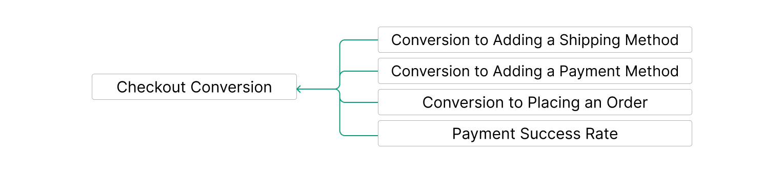
Checkout Conversion
Checkout Conversion is about what happens after someone finally decides to buy. They’ve picked a product, put it in the cart, clicked through — and now they’re ready to finish.
Checkout Conversion = Orders ÷ Sessions that reached Checkout
And yet, this stage is often where the biggest losses happen. It’s like standing in line at a store, items in hand, and then walking away right before the register.
Let’s look at the main points where shoppers drop.
Conversion to Adding a Shipping Method
Shipping is often the first stumbling block. If options are too expensive, too slow, or just too limited, people leave. Even the wording matters — “standard delivery” feels safer than “economy,” even if they mean the same thing.
💡 Compare drop-off by country or region. If one market has much higher abandonment, it’s usually a shipping options problem.
Conversion to Adding a Payment Method
Next comes payment. If shoppers don’t see their preferred option, they hesitate. Too many redirects or forced account creation can also break the flow.
💡 Segment by device. If mobile users drop more often here, it’s a sign payment UX isn’t mobile-friendly enough.
Conversion to Placing an Order
Even when shipping and payment are chosen, not everyone clicks “Place order.” Sometimes they want to double-check the total cost, sometimes they get distracted, and sometimes it’s just last-minute doubt. A long or confusing summary page can make this worse.
💡 Watch for sessions that reach the order page but never convert. If the gap is big, review the layout and clarity of the final summary.
Payment Success Rate
And finally, the technical part. Even when shoppers click “buy,” payments can fail. Declined cards, gateway errors, bank security checks — all of them eat into your final CR.
💡 Track failed payments by method. If one payment option has a much higher failure rate, it’s worth digging into the provider.
Final thoughts
A falling CR isn’t random. Shoppers can drop at different points — bouncing too early, losing interest in products, leaving carts behind, or getting stuck in checkout.
When your dashboard lights up red, the key isn’t guessing or rushing into fixes. It’s knowing which stage is breaking — so you can focus on the part of the journey that actually holds conversions back.
LinkedIn post of the week
Happy analyzing 🫶
See you next week!
Dmitry from JetMetrics